Building Amartha ‘Funds’ design systems
Building Amartha ‘Funds’ design systems
Building Amartha ‘Funds’ design systems
Design Systems are now common in leading companies due to large-scale, complex projects. Varying versions maintain design integrity and scalability across evolving products. This case study discusses the creation of a design system created by the Amartha design team.
Design Systems are now common in leading companies due to large-scale, complex projects. Varying versions maintain design integrity and scalability across evolving products. This case study discusses the creation of a design system created by the Amartha design team.
Company
Company
Amartha
Amartha
Role
Role
Product / Visual Designer
Product / Visual Designer
Scope
Scope
Design System, Design Governance, Quality Assurance
Design System, Design Governance, Quality Assurance
Period
Period
April - Dec 2024
April - Dec 2024
Background & Problems
Background & Problems
Initially, our team had no design system in place and we relied on meetings, team syncs, and mini-style guides in order to maintain a cohesive UI and consistent UX patterns. While this is manageable in a small team and a relatively simple product, we quickly realized that this wouldn’t be sustainable as more parts of the Amartha product ecosystem were being merged into one mobile app.
Initially, our team had no design system in place and we relied on meetings, team syncs, and mini-style guides in order to maintain a cohesive UI and consistent UX patterns. While this is manageable in a small team and a relatively simple product, we quickly realized that this wouldn’t be sustainable as more parts of the Amartha product ecosystem were being merged into one mobile app.
Objectives
Objectives
By creating an updated centralized design system, we aimed to:
Align our teams by giving them a more structured and guided way to build products.
Speed up our design and development process: with a ready-made library and patterns teams can create and test layouts much faster.
Improve brand perception and user trust through consistent experiences that work for everyone and allow users to accomplish their goals.
Promote accessibility of our products by building accessibility and inclusion into our component libraries, both from a design and code repository perspective.
While it was clear that this project would require a lot of resources, planning, and time commitments, we knew that this work was a justified long-term investment in our company, brand standards, and our customers.
The Process
The Process
There is no ideal process for everyone, but we think this process is quite ideal for our design team. We started with outreach to the relevant teams, then started working on the project by assembling a team that was divided into a research team, design team, writing team, engineering team, and project manager.
There is no ideal process for everyone, but we think this process is quite ideal for our design team. We started with outreach to the relevant teams, then started working on the project by assembling a team that was divided into a research team, design team, writing team, engineering team, and project manager.
Buy In
Buy In
In order to ensure the success of this project, it was important to get stakeholders on board before we started building our design system.
We systematically promoted the initiative via:
A kick-off company-wide presentation where we shared the current pain points and the anticipated benefits of the project for the company as a whole.
Involving engineering into the conversation early on through bi-weekly design system meetings and workshops to collect their input.
Sharing with squads work in progress and the roadmap of the project.
By getting other teams involved from the onset and as the project evolved, we strived to promote understanding of the project and inspire a sense of co-ownership throughout the entire process.
Development Phase
Development Phase
After completing the buy-in process, it's time to start developing a well-structured design system. To achieve this, we will proceed through four distinct phases:
After completing the buy-in process, it's time to start developing a well-structured design system. To achieve this, we will proceed through four distinct phases:
Research
Research
I researched competitors, target audiences, and industry trends to gain insights and identify improvement areas.
I researched competitors, target audiences, and industry trends to gain insights and identify improvement areas.
Review
Review
Next, I reviewed the existing design to identify pain points and inconsistencies, understand the current product state.
Next, I reviewed the existing design to identify pain points and inconsistencies, understand the current product state.
Design
Design
The initial research was vital in shaping Amartha's new brand and visual identity, guiding the overall design strategy in the rebranding and redesign project.
The initial research was vital in shaping Amartha's new brand and visual identity, guiding the overall design strategy in the rebranding and redesign project.
Documentation
Documentation
This phase involves documenting all components, styles, and guidelines clearly and organized, including their purpose, usage, and examples for implementation.
This phase involves documenting all components, styles, and guidelines clearly and organized, including their purpose, usage, and examples for implementation.
" height="99.85512919759017px" id="sASD5cOET" width="2188.000004364806px"/><path d="M 0 99.855 L 44.054 0" fill="transparent" height="99.85503163139649px" id="ZVe3rFGPv" stroke-dasharray="" stroke-linecap="square" stroke-linejoin="miter" stroke-miterlimit="10" stroke-width="1" stroke="rgb(235, 238, 240)" transform="translate(0 0)" width="44.05368691036721px"/><path d="M 0 99.855 L 44.054 0" fill="transparent" height="99.85503163139649px" id="qByMngO4Y" stroke-dasharray="" stroke-linecap="square" stroke-linejoin="miter" stroke-miterlimit="10" stroke-width="1" stroke="rgb(235, 238, 240)" transform="translate(14.685 0)" width="44.053691275167786px"/><path d="M 0 99.855 L 44.054 0" fill="transparent" height="99.85503163139649px" id="llbOem0Bk" stroke-dasharray="" stroke-linecap="square" stroke-linejoin="miter" stroke-miterlimit="10" stroke-width="1" stroke="rgb(235, 238, 240)" transform="translate(29.369 0)" width="44.05369127516779px"/><path d="M 0 99.855 L 44.054 0" fill="transparent" height="99.85503163139649px" id="dJIR7hwbY" stroke-dasharray="" stroke-linecap="square" stroke-linejoin="miter" stroke-miterlimit="10" stroke-width="1" stroke="rgb(235, 238, 240)" transform="translate(44.054 0)" width="44.053691275167786px"/><path d="M 0 99.855 L 44.054 0" fill="transparent" height="99.85503163139649px" id="w7Gee7Emo" stroke-dasharray="" stroke-linecap="square" stroke-linejoin="miter" stroke-miterlimit="10" stroke-width="1" stroke="rgb(235, 238, 240)" transform="translate(58.738 0)" width="44.053691275167786px"/><path d="M 0 99.855 L 44.054 0" fill="transparent" height="99.85503163139649px" id="TnTGIMNKk" stroke-dasharray="" stroke-linecap="square" stroke-linejoin="miter" stroke-miterlimit="10" stroke-width="1" stroke="rgb(235, 238, 240)" transform="translate(73.423 0)" width="44.05369127516778px"/><path d="M 0 99.855 L 44.054 0" fill="transparent" height="99.85503163139649px" id="wSlnpjH1A" stroke-dasharray="" stroke-linecap="square" stroke-linejoin="miter" stroke-miterlimit="10" stroke-width="1" stroke="rgb(235, 238, 240)" transform="translate(88.107 0)" width="44.05369127516779px"/><path d="M 0 99.855 L 44.054 0" fill="transparent" height="99.85503163139649px" id="K03mAi9Jc" stroke-dasharray="" stroke-linecap="square" stroke-linejoin="miter" stroke-miterlimit="10" stroke-width="1" stroke="rgb(235, 238, 240)" transform="translate(102.792 0)" width="44.05369127516779px"/><path d="M 0 99.855 L 44.054 0" fill="transparent" height="99.85503163139649px" id="ZEdc5ZKAo" stroke-dasharray="" stroke-linecap="square" stroke-linejoin="miter" stroke-miterlimit="10" stroke-width="1" stroke="rgb(235, 238, 240)" transform="translate(117.477 0)" width="44.05369127516779px"/><path d="M 0 99.855 L 44.054 0" fill="transparent" height="99.85503163139649px" id="GEsnWCnfi" stroke-dasharray="" stroke-linecap="square" stroke-linejoin="miter" stroke-miterlimit="10" stroke-width="1" stroke="rgb(235, 238, 240)" transform="translate(132.161 0)" width="44.05369127516778px"/><path d="M 0 99.855 L 44.054 0" fill="transparent" height="99.85503163139649px" id="L2AQ_UMCH" stroke-dasharray="" stroke-linecap="square" stroke-linejoin="miter" stroke-miterlimit="10" stroke-width="1" stroke="rgb(235, 238, 240)" transform="translate(146.846 0)" width="44.05369127516778px"/><path d="M 0 99.855 L 44.054 0" fill="transparent" height="99.85503163139649px" id="Ecl21yVQo" stroke-dasharray="" stroke-linecap="square" stroke-linejoin="miter" stroke-miterlimit="10" stroke-width="1" stroke="rgb(235, 238, 240)" transform="translate(161.53 0)" width="44.05369127516778px"/><path d="M 0 99.855 L 44.054 0" fill="transparent" height="99.85503163139649px" id="DYu_KdeFv" stroke-dasharray="" stroke-linecap="square" stroke-linejoin="miter" stroke-miterlimit="10" stroke-width="1" stroke="rgb(235, 238, 240)" transform="translate(176.215 0)" width="44.05369127516778px"/><path d="M 0 99.855 L 44.054 0" fill="transparent" height="99.85503163139649px" id="Yu56ubYu8" stroke-dasharray="" stroke-linecap="square" stroke-linejoin="miter" stroke-miterlimit="10" stroke-width="1" stroke="rgb(235, 238, 240)" transform="translate(190.899 0)" width="44.05369127516778px"/><path d="M 0 99.855 L 44.054 0" fill="transparent" height="99.85503163139649px" id="NwcbzAKDl" stroke-dasharray="" stroke-linecap="square" stroke-linejoin="miter" stroke-miterlimit="10" stroke-width="1" stroke="rgb(235, 238, 240)" transform="translate(205.584 0)" width="44.05369127516778px"/><path d="M 0 99.855 L 44.054 0" fill="transparent" height="99.85503163139649px" id="zMtlyHoVx" stroke-dasharray="" stroke-linecap="square" stroke-linejoin="miter" stroke-miterlimit="10" stroke-width="1" stroke="rgb(235, 238, 240)" transform="translate(220.268 0)" width="44.05369127516781px"/><path d="M 0 99.855 L 44.054 0" fill="transparent" height="99.85503163139649px" id="eksK8vjJd" stroke-dasharray="" stroke-linecap="square" stroke-linejoin="miter" stroke-miterlimit="10" stroke-width="1" stroke="rgb(235, 238, 240)" transform="translate(234.953 0)" width="44.05369127516778px"/><path d="M 0 99.855 L 44.054 0" fill="transparent" height="99.85503163139649px" id="MKIG5bRBi" stroke-dasharray="" stroke-linecap="square" stroke-linejoin="miter" stroke-miterlimit="10" stroke-width="1" stroke="rgb(235, 238, 240)" transform="translate(249.638 0)" width="44.05369127516781px"/><path d="M 0 99.855 L 44.054 0" fill="transparent" height="99.85503163139649px" id="qlPQ0FPCZ" stroke-dasharray="" stroke-linecap="square" stroke-linejoin="miter" stroke-miterlimit="10" stroke-width="1" stroke="rgb(235, 238, 240)" transform="translate(264.322 0)" width="44.05369127516775px"/><path d="M 0 99.855 L 44.054 0" fill="transparent" height="99.85503163139649px" id="GXmJ9YUFI" stroke-dasharray="" stroke-linecap="square" stroke-linejoin="miter" stroke-miterlimit="10" stroke-width="1" stroke="rgb(235, 238, 240)" transform="translate(279.007 0)" width="44.05369127516781px"/><path d="M 0 99.855 L 44.054 0" fill="transparent" height="99.85503163139649px" id="BaUS1t7Zc" stroke-dasharray="" stroke-linecap="square" stroke-linejoin="miter" stroke-miterlimit="10" stroke-width="1" stroke="rgb(235, 238, 240)" transform="translate(293.691 0)" width="44.05369127516775px"/><path d="M 0 99.855 L 44.054 0" fill="transparent" height="99.85503163139649px" id="rtNwh4TjZ" stroke-dasharray="" stroke-linecap="square" stroke-linejoin="miter" stroke-miterlimit="10" stroke-width="1" stroke="rgb(235, 238, 240)" transform="translate(308.376 0)" width="44.05369127516781px"/><path d="M 0 99.855 L 44.054 0" fill="transparent" height="99.85503163139649px" id="Tpomfgy5M" stroke-dasharray="" stroke-linecap="square" stroke-linejoin="miter" stroke-miterlimit="10" stroke-width="1" stroke="rgb(235, 238, 240)" transform="translate(323.06 0)" width="44.05369127516775px"/><path d="M 0 99.855 L 44.054 0" fill="transparent" height="99.85503163139649px" id="rUOIxupZ5" stroke-dasharray="" stroke-linecap="square" stroke-linejoin="miter" stroke-miterlimit="10" stroke-width="1" stroke="rgb(235, 238, 240)" transform="translate(337.745 0)" width="44.05369127516781px"/><path d="M 0 99.855 L 44.054 0" fill="transparent" height="99.85503163139649px" id="biagFAtxy" stroke-dasharray="" stroke-linecap="square" stroke-linejoin="miter" stroke-miterlimit="10" stroke-width="1" stroke="rgb(235, 238, 240)" transform="translate(352.43 0)" width="44.05369127516775px"/><path d="M 0 99.855 L 44.054 0" fill="transparent" height="99.85503163139649px" id="FbWu0DWrr" stroke-dasharray="" stroke-linecap="square" stroke-linejoin="miter" stroke-miterlimit="10" stroke-width="1" stroke="rgb(235, 238, 240)" transform="translate(367.114 0)" width="44.05369127516781px"/><path d="M 0 99.855 L 44.054 0" fill="transparent" height="99.85503163139649px" id="Ei2Nzms9q" stroke-dasharray="" stroke-linecap="square" stroke-linejoin="miter" stroke-miterlimit="10" stroke-width="1" stroke="rgb(235, 238, 240)" transform="translate(381.799 0)" width="44.05369127516775px"/><path d="M 0 99.855 L 44.054 0" fill="transparent" height="99.85503163139649px" id="mS_wSMuv_" stroke-dasharray="" stroke-linecap="square" stroke-linejoin="miter" stroke-miterlimit="10" stroke-width="1" stroke="rgb(235, 238, 240)" transform="translate(396.483 0)" width="44.05369127516781px"/><path d="M 0 99.855 L 44.054 0" fill="transparent" height="99.85503163139649px" id="oe37EHWG8" stroke-dasharray="" stroke-linecap="square" stroke-linejoin="miter" stroke-miterlimit="10" stroke-width="1" stroke="rgb(235, 238, 240)" transform="translate(411.168 0)" width="44.05369127516775px"/><path d="M 0 99.855 L 44.054 0" fill="transparent" height="99.85503163139649px" id="hahMlH9vQ" stroke-dasharray="" stroke-linecap="square" stroke-linejoin="miter" stroke-miterlimit="10" stroke-width="1" stroke="rgb(235, 238, 240)" transform="translate(425.852 0)" width="44.05369127516781px"/><path d="M 0 99.855 L 44.054 0" fill="transparent" height="99.85503163139649px" id="oRZwIeSZ2" stroke-dasharray="" stroke-linecap="square" stroke-linejoin="miter" stroke-miterlimit="10" stroke-width="1" stroke="rgb(235, 238, 240)" transform="translate(440.537 0)" width="44.05369127516775px"/><path d="M 0 99.855 L 44.054 0" fill="transparent" height="99.85503163139649px" id="aCxfzwNrg" stroke-dasharray="" stroke-linecap="square" stroke-linejoin="miter" stroke-miterlimit="10" stroke-width="1" stroke="rgb(235, 238, 240)" transform="translate(455.221 0)" width="44.05369127516781px"/><path d="M 0 99.855 L 44.054 0" fill="transparent" height="99.85503163139649px" id="A0kRyfOwZ" stroke-dasharray="" stroke-linecap="square" stroke-linejoin="miter" stroke-miterlimit="10" stroke-width="1" stroke="rgb(235, 238, 240)" transform="translate(469.906 0)" width="44.05369127516775px"/><path d="M 0 99.855 L 44.054 0" fill="transparent" height="99.85503163139649px" id="rc8VOQc4Z" stroke-dasharray="" stroke-linecap="square" stroke-linejoin="miter" stroke-miterlimit="10" stroke-width="1" stroke="rgb(235, 238, 240)" transform="translate(484.591 0)" width="44.053691275167864px"/><path d="M 0 99.855 L 44.054 0" fill="transparent" height="99.85503163139649px" id="EFs_aAkFp" stroke-dasharray="" stroke-linecap="square" stroke-linejoin="miter" stroke-miterlimit="10" stroke-width="1" stroke="rgb(235, 238, 240)" transform="translate(499.275 0)" width="44.05369127516781px"/><path d="M 0 99.855 L 44.054 0" fill="transparent" height="99.85503163139649px" id="VlLycR7_h" stroke-dasharray="" stroke-linecap="square" stroke-linejoin="miter" stroke-miterlimit="10" stroke-width="1" stroke="rgb(235, 238, 240)" transform="translate(513.96 0)" width="44.05369127516781px"/><path d="M 0 99.855 L 44.054 0" fill="transparent" height="99.85503163139649px" id="bUCtoCXDV" stroke-dasharray="" stroke-linecap="square" stroke-linejoin="miter" stroke-miterlimit="10" stroke-width="1" stroke="rgb(235, 238, 240)" transform="translate(528.644 0)" width="44.053691275167694px"/><path d="M 0 99.855 L 44.054 0" fill="transparent" height="99.85503163139649px" id="PRXFPoxO9" stroke-dasharray="" stroke-linecap="square" stroke-linejoin="miter" stroke-miterlimit="10" stroke-width="1" stroke="rgb(235, 238, 240)" transform="translate(543.329 0)" width="44.05369127516781px"/><path d="M 0 99.855 L 44.054 0" fill="transparent" height="99.85503163139649px" id="vF36EoQr1" stroke-dasharray="" stroke-linecap="square" stroke-linejoin="miter" stroke-miterlimit="10" stroke-width="1" stroke="rgb(235, 238, 240)" transform="translate(558.013 0)" width="44.05369127516781px"/><path d="M 0 99.855 L 44.054 0" fill="transparent" height="99.85503163139649px" id="H4sMjjeIa" stroke-dasharray="" stroke-linecap="square" stroke-linejoin="miter" stroke-miterlimit="10" stroke-width="1" stroke="rgb(235, 238, 240)" transform="translate(572.698 0)" width="44.05369127516781px"/><path d="M 0 99.855 L 44.054 0" fill="transparent" height="99.85503163139649px" id="yBWuUg8kR" stroke-dasharray="" stroke-linecap="square" stroke-linejoin="miter" stroke-miterlimit="10" stroke-width="1" stroke="rgb(235, 238, 240)" transform="translate(587.383 0)" width="44.053691275167694px"/><path d="M 0 99.855 L 44.054 0" fill="transparent" height="99.85503163139649px" id="YsWGz8Sxr" stroke-dasharray="" stroke-linecap="square" stroke-linejoin="miter" stroke-miterlimit="10" stroke-width="1" stroke="rgb(235, 238, 240)" transform="translate(602.067 0)" width="44.05369127516781px"/><path d="M 0 99.855 L 44.054 0" fill="transparent" height="99.85503163139649px" id="Xc39cqNwB" stroke-dasharray="" stroke-linecap="square" stroke-linejoin="miter" stroke-miterlimit="10" stroke-width="1" stroke="rgb(235, 238, 240)" transform="translate(616.752 0)" width="44.05369127516781px"/><path d="M 0 99.855 L 44.054 0" fill="transparent" height="99.85503163139649px" id="RJeWgHg6i" stroke-dasharray="" stroke-linecap="square" stroke-linejoin="miter" stroke-miterlimit="10" stroke-width="1" stroke="rgb(235, 238, 240)" transform="translate(631.436 0)" width="44.05369127516781px"/><path d="M 0 99.855 L 44.054 0" fill="transparent" height="99.85503163139649px" id="yLNtfFVD1" stroke-dasharray="" stroke-linecap="square" stroke-linejoin="miter" stroke-miterlimit="10" stroke-width="1" stroke="rgb(235, 238, 240)" transform="translate(646.121 0)" width="44.053691275167694px"/><path d="M 0 99.855 L 44.054 0" fill="transparent" height="99.85503163139649px" id="AwhmIw234" stroke-dasharray="" stroke-linecap="square" stroke-linejoin="miter" stroke-miterlimit="10" stroke-width="1" stroke="rgb(235, 238, 240)" transform="translate(660.805 0)" width="44.05369127516781px"/><path d="M 0 99.855 L 44.054 0" fill="transparent" height="99.85503163139649px" id="jaEdn6MRn" stroke-dasharray="" stroke-linecap="square" stroke-linejoin="miter" stroke-miterlimit="10" stroke-width="1" stroke="rgb(235, 238, 240)" transform="translate(675.49 0)" width="44.05369127516781px"/><path d="M 0 99.855 L 44.054 0" fill="transparent" height="99.85503163139649px" id="zbzpwNUHX" stroke-dasharray="" stroke-linecap="square" stroke-linejoin="miter" stroke-miterlimit="10" stroke-width="1" stroke="rgb(235, 238, 240)" transform="translate(690.174 0)" width="44.05369127516781px"/><path d="M 0 99.855 L 44.054 0" fill="transparent" height="99.85503163139649px" id="z7TzBckhN" stroke-dasharray="" stroke-linecap="square" stroke-linejoin="miter" stroke-miterlimit="10" stroke-width="1" stroke="rgb(235, 238, 240)" transform="translate(704.859 0)" width="44.053691275167694px"/><path d="M 0 99.855 L 44.054 0" fill="transparent" height="99.85503163139649px" id="IMGv1eU4E" stroke-dasharray="" stroke-linecap="square" stroke-linejoin="miter" stroke-miterlimit="10" stroke-width="1" stroke="rgb(235, 238, 240)" transform="translate(719.544 0)" width="44.05369127516781px"/><path d="M 0 99.855 L 44.054 0" fill="transparent" height="99.85503163139649px" id="W2odIKgcz" stroke-dasharray="" stroke-linecap="square" stroke-linejoin="miter" stroke-miterlimit="10" stroke-width="1" stroke="rgb(235, 238, 240)" transform="translate(734.228 0)" width="44.05369127516781px"/><path d="M 0 99.855 L 44.054 0" fill="transparent" height="99.85503163139649px" id="q0S3tc1i_" stroke-dasharray="" stroke-linecap="square" stroke-linejoin="miter" stroke-miterlimit="10" stroke-width="1" stroke="rgb(235, 238, 240)" transform="translate(748.913 0)" width="44.05369127516781px"/><path d="M 0 99.855 L 44.054 0" fill="transparent" height="99.85503163139649px" id="eaYIkyZxn" stroke-dasharray="" stroke-linecap="square" stroke-linejoin="miter" stroke-miterlimit="10" stroke-width="1" stroke="rgb(235, 238, 240)" transform="translate(763.597 0)" width="44.05369127516781px"/><path d="M 0 99.855 L 44.054 0" fill="transparent" height="99.85503163139649px" id="SrJR07vdE" stroke-dasharray="" stroke-linecap="square" stroke-linejoin="miter" stroke-miterlimit="10" stroke-width="1" stroke="rgb(235, 238, 240)" transform="translate(778.282 0)" width="44.05369127516781px"/><path d="M 0 99.855 L 44.054 0" fill="transparent" height="99.85503163139649px" id="pGksC879K" stroke-dasharray="" stroke-linecap="square" stroke-linejoin="miter" stroke-miterlimit="10" stroke-width="1" stroke="rgb(235, 238, 240)" transform="translate(792.966 0)" width="44.05369127516781px"/><path d="M 0 99.855 L 44.054 0" fill="transparent" height="99.85503163139649px" id="H8Z6lXi0n" stroke-dasharray="" stroke-linecap="square" stroke-linejoin="miter" stroke-miterlimit="10" stroke-width="1" stroke="rgb(235, 238, 240)" transform="translate(807.651 0)" width="44.053691275167694px"/><path d="M 0 99.855 L 44.054 0" fill="transparent" height="99.85503163139649px" id="ZxW6173uv" stroke-dasharray="" stroke-linecap="square" stroke-linejoin="miter" stroke-miterlimit="10" stroke-width="1" stroke="rgb(235, 238, 240)" transform="translate(822.336 0)" width="44.05369127516781px"/><path d="M 0 99.855 L 44.054 0" fill="transparent" height="99.85503163139649px" id="EDtklbfOX" stroke-dasharray="" stroke-linecap="square" stroke-linejoin="miter" stroke-miterlimit="10" stroke-width="1" stroke="rgb(235, 238, 240)" transform="translate(837.02 0)" width="44.05369127516781px"/><path d="M 0 99.855 L 44.054 0" fill="transparent" height="99.85503163139649px" id="GzbmQLTcS" stroke-dasharray="" stroke-linecap="square" stroke-linejoin="miter" stroke-miterlimit="10" stroke-width="1" stroke="rgb(235, 238, 240)" transform="translate(851.705 0)" width="44.05369127516781px"/><path d="M 0 99.855 L 44.054 0" fill="transparent" height="99.85503163139649px" id="IFxkuqQMC" stroke-dasharray="" stroke-linecap="square" stroke-linejoin="miter" stroke-miterlimit="10" stroke-width="1" stroke="rgb(235, 238, 240)" transform="translate(866.389 0)" width="44.053691275167694px"/><path d="M 0 99.855 L 44.054 0" fill="transparent" height="99.85503163139649px" id="tGA2hKIvi" stroke-dasharray="" stroke-linecap="square" stroke-linejoin="miter" stroke-miterlimit="10" stroke-width="1" stroke="rgb(235, 238, 240)" transform="translate(881.074 0)" width="44.05369127516781px"/><path d="M 0 99.855 L 44.054 0" fill="transparent" height="99.85503163139649px" id="JQ92rJzqi" stroke-dasharray="" stroke-linecap="square" stroke-linejoin="miter" stroke-miterlimit="10" stroke-width="1" stroke="rgb(235, 238, 240)" transform="translate(895.758 0)" width="44.05369127516781px"/><path d="M 0 99.855 L 44.054 0" fill="transparent" height="99.85503163139649px" id="waGa2vqZw" stroke-dasharray="" stroke-linecap="square" stroke-linejoin="miter" stroke-miterlimit="10" stroke-width="1" stroke="rgb(235, 238, 240)" transform="translate(910.443 0)" width="44.05369127516781px"/><path d="M 0 99.855 L 44.054 0" fill="transparent" height="99.85503163139649px" id="zuztraCTk" stroke-dasharray="" stroke-linecap="square" stroke-linejoin="miter" stroke-miterlimit="10" stroke-width="1" stroke="rgb(235, 238, 240)" transform="translate(925.128 0)" width="44.053691275167694px"/><path d="M 0 99.855 L 44.054 0" fill="transparent" height="99.85503163139649px" id="N1_8gSTkB" stroke-dasharray="" stroke-linecap="square" stroke-linejoin="miter" stroke-miterlimit="10" stroke-width="1" stroke="rgb(235, 238, 240)" transform="translate(939.812 0)" width="44.05369127516781px"/><path d="M 0 99.855 L 44.054 0" fill="transparent" height="99.85503163139649px" id="zvKmq78lb" stroke-dasharray="" stroke-linecap="square" stroke-linejoin="miter" stroke-miterlimit="10" stroke-width="1" stroke="rgb(235, 238, 240)" transform="translate(954.497 0)" width="44.05369127516781px"/><path d="M 0 99.855 L 44.054 0" fill="transparent" height="99.85503163139649px" id="jtRL1blB5" stroke-dasharray="" stroke-linecap="square" stroke-linejoin="miter" stroke-miterlimit="10" stroke-width="1" stroke="rgb(235, 238, 240)" transform="translate(969.181 0)" width="44.05369127516781px"/><path d="M 0 99.855 L 44.054 0" fill="transparent" height="99.85503163139649px" id="fhR8LdlMj" stroke-dasharray="" stroke-linecap="square" stroke-linejoin="miter" stroke-miterlimit="10" stroke-width="1" stroke="rgb(235, 238, 240)" transform="translate(983.866 0)" width="44.053691275167694px"/><path d="M 0 99.855 L 44.054 0" fill="transparent" height="99.85503163139649px" id="VErDK6sF2" stroke-dasharray="" stroke-linecap="square" stroke-linejoin="miter" stroke-miterlimit="10" stroke-width="1" stroke="rgb(235, 238, 240)" transform="translate(998.55 0)" width="44.053691275167694px"/><path d="M 0 99.855 L 44.054 0" fill="transparent" height="99.85503163139649px" id="a7ReDA3vT" stroke-dasharray="" stroke-linecap="square" stroke-linejoin="miter" stroke-miterlimit="10" stroke-width="1" stroke="rgb(235, 238, 240)" transform="translate(1013.235 0)" width="44.05369127516792px"/><path d="M 0 99.855 L 44.054 0" fill="transparent" height="99.85503163139649px" id="pWt2xfn9r" stroke-dasharray="" stroke-linecap="square" stroke-linejoin="miter" stroke-miterlimit="10" stroke-width="1" stroke="rgb(235, 238, 240)" transform="translate(1027.919 0)" width="44.05369127516792px"/><path d="M 0 99.855 L 44.054 0" fill="transparent" height="99.85503163139649px" id="jkADEBIc7" stroke-dasharray="" stroke-linecap="square" stroke-linejoin="miter" stroke-miterlimit="10" stroke-width="1" stroke="rgb(235, 238, 240)" transform="translate(1042.604 0)" width="44.05369127516792px"/><path d="M 0 99.855 L 44.054 0" fill="transparent" height="99.85503163139649px" id="F93wFv5p2" stroke-dasharray="" stroke-linecap="square" stroke-linejoin="miter" stroke-miterlimit="10" stroke-width="1" stroke="rgb(235, 238, 240)" transform="translate(1057.289 0)" width="44.053691275167694px"/><path d="M 0 99.855 L 44.054 0" fill="transparent" height="99.85503163139649px" id="wQAcSVChK" stroke-dasharray="" stroke-linecap="square" stroke-linejoin="miter" stroke-miterlimit="10" stroke-width="1" stroke="rgb(235, 238, 240)" transform="translate(1071.973 0)" width="44.053691275167694px"/><path d="M 0 99.855 L 44.054 0" fill="transparent" height="99.85503163139649px" id="oF8B7up1q" stroke-dasharray="" stroke-linecap="square" stroke-linejoin="miter" stroke-miterlimit="10" stroke-width="1" stroke="rgb(235, 238, 240)" transform="translate(1086.658 0)" width="44.053691275167694px"/><path d="M 0 99.855 L 44.054 0" fill="transparent" height="99.85503163139649px" id="p7CApwQMd" stroke-dasharray="" stroke-linecap="square" stroke-linejoin="miter" stroke-miterlimit="10" stroke-width="1" stroke="rgb(235, 238, 240)" transform="translate(1101.342 0)" width="44.053691275167694px"/><path d="M 0 99.855 L 44.054 0" fill="transparent" height="99.85503163139649px" id="PlUMRzL_C" stroke-dasharray="" stroke-linecap="square" stroke-linejoin="miter" stroke-miterlimit="10" stroke-width="1" stroke="rgb(235, 238, 240)" transform="translate(1116.027 0)" width="44.053691275167694px"/><path d="M 0 99.855 L 44.054 0" fill="transparent" height="99.85503163139649px" id="oodGnyrwz" stroke-dasharray="" stroke-linecap="square" stroke-linejoin="miter" stroke-miterlimit="10" stroke-width="1" stroke="rgb(235, 238, 240)" transform="translate(1130.711 0)" width="44.05369127516792px"/><path d="M 0 99.855 L 44.054 0" fill="transparent" height="99.85503163139649px" id="SfrO9QNbo" stroke-dasharray="" stroke-linecap="square" stroke-linejoin="miter" stroke-miterlimit="10" stroke-width="1" stroke="rgb(235, 238, 240)" transform="translate(1145.396 0)" width="44.05369127516792px"/><path d="M 0 99.855 L 44.054 0" fill="transparent" height="99.85503163139649px" id="HmErO5JhJ" stroke-dasharray="" stroke-linecap="square" stroke-linejoin="miter" stroke-miterlimit="10" stroke-width="1" stroke="rgb(235, 238, 240)" transform="translate(1160.081 0)" width="44.05369127516792px"/><path d="M 0 99.855 L 44.054 0" fill="transparent" height="99.85503163139649px" id="zckKKWVyf" stroke-dasharray="" stroke-linecap="square" stroke-linejoin="miter" stroke-miterlimit="10" stroke-width="1" stroke="rgb(235, 238, 240)" transform="translate(1174.765 0)" width="44.053691275167694px"/><path d="M 0 99.855 L 44.054 0" fill="transparent" height="99.85503163139649px" id="cUMXKkvVZ" stroke-dasharray="" stroke-linecap="square" stroke-linejoin="miter" stroke-miterlimit="10" stroke-width="1" stroke="rgb(235, 238, 240)" transform="translate(1189.45 0)" width="44.053691275167694px"/><path d="M 0 99.855 L 44.054 0" fill="transparent" height="99.85503163139649px" id="mnlkUaPVh" stroke-dasharray="" stroke-linecap="square" stroke-linejoin="miter" stroke-miterlimit="10" stroke-width="1" stroke="rgb(235, 238, 240)" transform="translate(1204.134 0)" width="44.053691275167694px"/><path d="M 0 99.855 L 44.054 0" fill="transparent" height="99.85503163139649px" id="GhFRPbtUh" stroke-dasharray="" stroke-linecap="square" stroke-linejoin="miter" stroke-miterlimit="10" stroke-width="1" stroke="rgb(235, 238, 240)" transform="translate(1218.819 0)" width="44.053691275167694px"/><path d="M 0 99.855 L 44.054 0" fill="transparent" height="99.85503163139649px" id="n_lFL6CLk" stroke-dasharray="" stroke-linecap="square" stroke-linejoin="miter" stroke-miterlimit="10" stroke-width="1" stroke="rgb(235, 238, 240)" transform="translate(1233.503 0)" width="44.05369127516792px"/><path d="M 0 99.855 L 44.054 0" fill="transparent" height="99.85503163139649px" id="Z3pmhdQ8N" stroke-dasharray="" stroke-linecap="square" stroke-linejoin="miter" stroke-miterlimit="10" stroke-width="1" stroke="rgb(235, 238, 240)" transform="translate(1248.188 0)" width="44.05369127516792px"/><path d="M 0 99.855 L 44.054 0" fill="transparent" height="99.85503163139649px" id="fBrv1xvAd" stroke-dasharray="" stroke-linecap="square" stroke-linejoin="miter" stroke-miterlimit="10" stroke-width="1" stroke="rgb(235, 238, 240)" transform="translate(1262.873 0)" width="44.05369127516792px"/><path d="M 0 99.855 L 44.054 0" fill="transparent" height="99.85503163139649px" id="fRn7JalKN" stroke-dasharray="" stroke-linecap="square" stroke-linejoin="miter" stroke-miterlimit="10" stroke-width="1" stroke="rgb(235, 238, 240)" transform="translate(1277.557 0)" width="44.053691275167694px"/><path d="M 0 99.855 L 44.054 0" fill="transparent" height="99.85503163139649px" id="RmAbk60Ib" stroke-dasharray="" stroke-linecap="square" stroke-linejoin="miter" stroke-miterlimit="10" stroke-width="1" stroke="rgb(235, 238, 240)" transform="translate(1292.242 0)" width="44.053691275167694px"/><path d="M 0 99.855 L 44.054 0" fill="transparent" height="99.85503163139649px" id="H3XvTxI85" stroke-dasharray="" stroke-linecap="square" stroke-linejoin="miter" stroke-miterlimit="10" stroke-width="1" stroke="rgb(235, 238, 240)" transform="translate(1306.926 0)" width="44.053691275167694px"/><path d="M 0 99.855 L 44.054 0" fill="transparent" height="99.85503163139649px" id="AG5bUbmBx" stroke-dasharray="" stroke-linecap="square" stroke-linejoin="miter" stroke-miterlimit="10" stroke-width="1" stroke="rgb(235, 238, 240)" transform="translate(1321.611 0)" width="44.053691275167694px"/><path d="M 0 99.855 L 44.054 0" fill="transparent" height="99.85503163139649px" id="kc2PRC2py" stroke-dasharray="" stroke-linecap="square" stroke-linejoin="miter" stroke-miterlimit="10" stroke-width="1" stroke="rgb(235, 238, 240)" transform="translate(1336.295 0)" width="44.053691275167694px"/><path d="M 0 99.855 L 44.054 0" fill="transparent" height="99.85503163139649px" id="nbYjmK7H0" stroke-dasharray="" stroke-linecap="square" stroke-linejoin="miter" stroke-miterlimit="10" stroke-width="1" stroke="rgb(235, 238, 240)" transform="translate(1350.98 0)" width="44.05369127516792px"/><path d="M 0 99.855 L 44.054 0" fill="transparent" height="99.85503163139649px" id="FdGwJjniW" stroke-dasharray="" stroke-linecap="square" stroke-linejoin="miter" stroke-miterlimit="10" stroke-width="1" stroke="rgb(235, 238, 240)" transform="translate(1365.664 0)" width="44.05369127516792px"/><path d="M 0 99.855 L 44.054 0" fill="transparent" height="99.85503163139649px" id="HYNbfKNJx" stroke-dasharray="" stroke-linecap="square" stroke-linejoin="miter" stroke-miterlimit="10" stroke-width="1" stroke="rgb(235, 238, 240)" transform="translate(1380.349 0)" width="44.05369127516792px"/><path d="M 0 99.855 L 44.054 0" fill="transparent" height="99.85503163139649px" id="Tb0QTTdb0" stroke-dasharray="" stroke-linecap="square" stroke-linejoin="miter" stroke-miterlimit="10" stroke-width="1" stroke="rgb(235, 238, 240)" transform="translate(1395.034 0)" width="44.053691275167694px"/><path d="M 0 99.855 L 44.054 0" fill="transparent" height="99.85503163139649px" id="Wh8p9dsD_" stroke-dasharray="" stroke-linecap="square" stroke-linejoin="miter" stroke-miterlimit="10" stroke-width="1" stroke="rgb(235, 238, 240)" transform="translate(1409.718 0)" width="44.053691275167694px"/><path d="M 0 99.855 L 44.054 0" fill="transparent" height="99.85503163139649px" id="k4EeuhcbT" stroke-dasharray="" stroke-linecap="square" stroke-linejoin="miter" stroke-miterlimit="10" stroke-width="1" stroke="rgb(235, 238, 240)" transform="translate(1424.403 0)" width="44.053691275167694px"/><path d="M 0 99.855 L 44.054 0" fill="transparent" height="99.85503163139649px" id="EILlAVX7g" stroke-dasharray="" stroke-linecap="square" stroke-linejoin="miter" stroke-miterlimit="10" stroke-width="1" stroke="rgb(235, 238, 240)" transform="translate(1439.087 0)" width="44.053691275167694px"/><path d="M 0 99.855 L 44.054 0" fill="transparent" height="99.85503163139649px" id="HMhEG7Bis" stroke-dasharray="" stroke-linecap="square" stroke-linejoin="miter" stroke-miterlimit="10" stroke-width="1" stroke="rgb(235, 238, 240)" transform="translate(1453.772 0)" width="44.053691275167694px"/><path d="M 0 99.855 L 44.054 0" fill="transparent" height="99.85503163139649px" id="GRBN8sZek" stroke-dasharray="" stroke-linecap="square" stroke-linejoin="miter" stroke-miterlimit="10" stroke-width="1" stroke="rgb(235, 238, 240)" transform="translate(1468.456 0)" width="44.05369127516792px"/><path d="M 0 99.855 L 44.054 0" fill="transparent" height="99.85503163139649px" id="wLPzL61YS" stroke-dasharray="" stroke-linecap="square" stroke-linejoin="miter" stroke-miterlimit="10" stroke-width="1" stroke="rgb(235, 238, 240)" transform="translate(1483.141 0)" width="44.05369127516792px"/><path d="M 0 99.855 L 44.054 0" fill="transparent" height="99.85503163139649px" id="p7FpdCbVk" stroke-dasharray="" stroke-linecap="square" stroke-linejoin="miter" stroke-miterlimit="10" stroke-width="1" stroke="rgb(235, 238, 240)" transform="translate(1497.825 0)" width="44.05369127516792px"/><path d="M 0 99.855 L 44.054 0" fill="transparent" height="99.85503163139649px" id="lUMaRuH6g" stroke-dasharray="" stroke-linecap="square" stroke-linejoin="miter" stroke-miterlimit="10" stroke-width="1" stroke="rgb(235, 238, 240)" transform="translate(1512.51 0)" width="44.053691275167694px"/><path d="M 0 99.855 L 44.054 0" fill="transparent" height="99.85503163139649px" id="axJHZR6fV" stroke-dasharray="" stroke-linecap="square" stroke-linejoin="miter" stroke-miterlimit="10" stroke-width="1" stroke="rgb(235, 238, 240)" transform="translate(1527.195 0)" width="44.053691275167694px"/><path d="M 0 99.855 L 44.054 0" fill="transparent" height="99.85503163139649px" id="YxdHWVONb" stroke-dasharray="" stroke-linecap="square" stroke-linejoin="miter" stroke-miterlimit="10" stroke-width="1" stroke="rgb(235, 238, 240)" transform="translate(1541.879 0)" width="44.053691275167694px"/><path d="M 0 99.855 L 44.054 0" fill="transparent" height="99.85503163139649px" id="ifgWtqhGo" stroke-dasharray="" stroke-linecap="square" stroke-linejoin="miter" stroke-miterlimit="10" stroke-width="1" stroke="rgb(235, 238, 240)" transform="translate(1556.564 0)" width="44.053691275167694px"/><path d="M 0 99.855 L 44.054 0" fill="transparent" height="99.85503163139649px" id="noSH3DHuQ" stroke-dasharray="" stroke-linecap="square" stroke-linejoin="miter" stroke-miterlimit="10" stroke-width="1" stroke="rgb(235, 238, 240)" transform="translate(1571.248 0)" width="44.05369127516792px"/><path d="M 0 99.855 L 44.054 0" fill="transparent" height="99.85503163139649px" id="n9bJCmjEO" stroke-dasharray="" stroke-linecap="square" stroke-linejoin="miter" stroke-miterlimit="10" stroke-width="1" stroke="rgb(235, 238, 240)" transform="translate(1585.933 0)" width="44.05369127516792px"/><path d="M 0 99.855 L 44.054 0" fill="transparent" height="99.85503163139649px" id="KP12iyy3K" stroke-dasharray="" stroke-linecap="square" stroke-linejoin="miter" stroke-miterlimit="10" stroke-width="1" stroke="rgb(235, 238, 240)" transform="translate(1600.617 0)" width="44.05369127516792px"/><path d="M 0 99.855 L 44.054 0" fill="transparent" height="99.85503163139649px" id="oG1PyvIP8" stroke-dasharray="" stroke-linecap="square" stroke-linejoin="miter" stroke-miterlimit="10" stroke-width="1" stroke="rgb(235, 238, 240)" transform="translate(1615.302 0)" width="44.053691275167694px"/><path d="M 0 99.855 L 44.054 0" fill="transparent" height="99.85503163139649px" id="QjmW_1Hsf" stroke-dasharray="" stroke-linecap="square" stroke-linejoin="miter" stroke-miterlimit="10" stroke-width="1" stroke="rgb(235, 238, 240)" transform="translate(1629.987 0)" width="44.053691275167694px"/><path d="M 0 99.855 L 44.054 0" fill="transparent" height="99.85503163139649px" id="Cv5FzOCgw" stroke-dasharray="" stroke-linecap="square" stroke-linejoin="miter" stroke-miterlimit="10" stroke-width="1" stroke="rgb(235, 238, 240)" transform="translate(1644.671 0)" width="44.053691275167694px"/><path d="M 0 99.855 L 44.054 0" fill="transparent" height="99.85503163139649px" id="eJhW7dIA7" stroke-dasharray="" stroke-linecap="square" stroke-linejoin="miter" stroke-miterlimit="10" stroke-width="1" stroke="rgb(235, 238, 240)" transform="translate(1659.356 0)" width="44.053691275167694px"/><path d="M 0 99.855 L 44.054 0" fill="transparent" height="99.85503163139649px" id="LBjwkzsNb" stroke-dasharray="" stroke-linecap="square" stroke-linejoin="miter" stroke-miterlimit="10" stroke-width="1" stroke="rgb(235, 238, 240)" transform="translate(1674.04 0)" width="44.053691275167694px"/><path d="M 0 99.855 L 44.054 0" fill="transparent" height="99.85503163139649px" id="Vo31_gblu" stroke-dasharray="" stroke-linecap="square" stroke-linejoin="miter" stroke-miterlimit="10" stroke-width="1" stroke="rgb(235, 238, 240)" transform="translate(1688.725 0)" width="44.05369127516792px"/><path d="M 0 99.855 L 44.054 0" fill="transparent" height="99.85503163139649px" id="Qc088S08Q" stroke-dasharray="" stroke-linecap="square" stroke-linejoin="miter" stroke-miterlimit="10" stroke-width="1" stroke="rgb(235, 238, 240)" transform="translate(1703.409 0)" width="44.05369127516792px"/><path d="M 0 99.855 L 44.054 0" fill="transparent" height="99.85503163139649px" id="jxNw7JiaU" stroke-dasharray="" stroke-linecap="square" stroke-linejoin="miter" stroke-miterlimit="10" stroke-width="1" stroke="rgb(235, 238, 240)" transform="translate(1718.094 0)" width="44.05369127516792px"/><path d="M 0 99.855 L 44.054 0" fill="transparent" height="99.85503163139649px" id="MtCN0mICU" stroke-dasharray="" stroke-linecap="square" stroke-linejoin="miter" stroke-miterlimit="10" stroke-width="1" stroke="rgb(235, 238, 240)" transform="translate(1732.778 0)" width="44.053691275167694px"/><path d="M 0 99.855 L 44.054 0" fill="transparent" height="99.85503163139649px" id="nb_jpQVK9" stroke-dasharray="" stroke-linecap="square" stroke-linejoin="miter" stroke-miterlimit="10" stroke-width="1" stroke="rgb(235, 238, 240)" transform="translate(1747.463 0)" width="44.053691275167694px"/><path d="M 0 99.855 L 44.054 0" fill="transparent" height="99.85503163139649px" id="IcH5Jry8Q" stroke-dasharray="" stroke-linecap="square" stroke-linejoin="miter" stroke-miterlimit="10" stroke-width="1" stroke="rgb(235, 238, 240)" transform="translate(1762.148 0)" width="44.053691275167694px"/><path d="M 0 99.855 L 44.054 0" fill="transparent" height="99.85503163139649px" id="mvERqb3HB" stroke-dasharray="" stroke-linecap="square" stroke-linejoin="miter" stroke-miterlimit="10" stroke-width="1" stroke="rgb(235, 238, 240)" transform="translate(1776.832 0)" width="44.053691275167694px"/><path d="M 0 99.855 L 44.054 0" fill="transparent" height="99.85503163139649px" id="XLJMxs2qw" stroke-dasharray="" stroke-linecap="square" stroke-linejoin="miter" stroke-miterlimit="10" stroke-width="1" stroke="rgb(235, 238, 240)" transform="translate(1791.517 0)" width="44.05369127516792px"/><path d="M 0 99.855 L 44.054 0" fill="transparent" height="99.85503163139649px" id="yZPrIzrXa" stroke-dasharray="" stroke-linecap="square" stroke-linejoin="miter" stroke-miterlimit="10" stroke-width="1" stroke="rgb(235, 238, 240)" transform="translate(1806.201 0)" width="44.05369127516792px"/><path d="M 0 99.855 L 44.054 0" fill="transparent" height="99.85503163139649px" id="ll8ybMMR1" stroke-dasharray="" stroke-linecap="square" stroke-linejoin="miter" stroke-miterlimit="10" stroke-width="1" stroke="rgb(235, 238, 240)" transform="translate(1820.886 0)" width="44.05369127516792px"/><path d="M 0 99.855 L 44.054 0" fill="transparent" height="99.85503163139649px" id="IDMjPplUG" stroke-dasharray="" stroke-linecap="square" stroke-linejoin="miter" stroke-miterlimit="10" stroke-width="1" stroke="rgb(235, 238, 240)" transform="translate(1835.571 0)" width="44.053691275167694px"/><path d="M 0 99.855 L 44.054 0" fill="transparent" height="99.85503163139649px" id="lOr9J2DHT" stroke-dasharray="" stroke-linecap="square" stroke-linejoin="miter" stroke-miterlimit="10" stroke-width="1" stroke="rgb(235, 238, 240)" transform="translate(1850.255 0)" width="44.053691275167694px"/><path d="M 0 99.855 L 44.054 0" fill="transparent" height="99.85503163139649px" id="v1BBWs8eZ" stroke-dasharray="" stroke-linecap="square" stroke-linejoin="miter" stroke-miterlimit="10" stroke-width="1" stroke="rgb(235, 238, 240)" transform="translate(1864.94 0)" width="44.053691275167694px"/><path d="M 0 99.855 L 44.054 0" fill="transparent" height="99.85503163139649px" id="AqB6Zok4t" stroke-dasharray="" stroke-linecap="square" stroke-linejoin="miter" stroke-miterlimit="10" stroke-width="1" stroke="rgb(235, 238, 240)" transform="translate(1879.624 0)" width="44.053691275167694px"/><path d="M 0 99.855 L 44.054 0" fill="transparent" height="99.85503163139649px" id="NNDiEvqZV" stroke-dasharray="" stroke-linecap="square" stroke-linejoin="miter" stroke-miterlimit="10" stroke-width="1" stroke="rgb(235, 238, 240)" transform="translate(1894.309 0)" width="44.053691275167694px"/><path d="M 0 99.855 L 44.054 0" fill="transparent" height="99.85503163139649px" id="rWy8tuLvb" stroke-dasharray="" stroke-linecap="square" stroke-linejoin="miter" stroke-miterlimit="10" stroke-width="1" stroke="rgb(235, 238, 240)" transform="translate(1908.993 0)" width="44.05369127516792px"/><path d="M 0 99.855 L 44.054 0" fill="transparent" height="99.85503163139649px" id="fnZxDfw18" stroke-dasharray="" stroke-linecap="square" stroke-linejoin="miter" stroke-miterlimit="10" stroke-width="1" stroke="rgb(235, 238, 240)" transform="translate(1923.678 0)" width="44.05369127516792px"/><path d="M 0 99.855 L 44.054 0" fill="transparent" height="99.85503163139649px" id="t8lXLCw0U" stroke-dasharray="" stroke-linecap="square" stroke-linejoin="miter" stroke-miterlimit="10" stroke-width="1" stroke="rgb(235, 238, 240)" transform="translate(1938.362 0)" width="44.05369127516792px"/><path d="M 0 99.855 L 44.054 0" fill="transparent" height="99.85503163139649px" id="fJn21UlME" stroke-dasharray="" stroke-linecap="square" stroke-linejoin="miter" stroke-miterlimit="10" stroke-width="1" stroke="rgb(235, 238, 240)" transform="translate(1953.047 0)" width="44.053691275167694px"/><path d="M 0 99.855 L 44.054 0" fill="transparent" height="99.85503163139649px" id="q257dfLCR" stroke-dasharray="" stroke-linecap="square" stroke-linejoin="miter" stroke-miterlimit="10" stroke-width="1" stroke="rgb(235, 238, 240)" transform="translate(1967.732 0)" width="44.053691275167694px"/><path d="M 0 99.855 L 44.054 0" fill="transparent" height="99.85503163139649px" id="qxF7P0pDX" stroke-dasharray="" stroke-linecap="square" stroke-linejoin="miter" stroke-miterlimit="10" stroke-width="1" stroke="rgb(235, 238, 240)" transform="translate(1982.416 0)" width="44.053691275167694px"/><path d="M 0 99.855 L 44.054 0" fill="transparent" height="99.85503163139649px" id="bEBW0rKMi" stroke-dasharray="" stroke-linecap="square" stroke-linejoin="miter" stroke-miterlimit="10" stroke-width="1" stroke="rgb(235, 238, 240)" transform="translate(1997.101 0)" width="44.053691275167694px"/><path d="M 0 99.855 L 44.054 0" fill="transparent" height="99.85503163139649px" id="iW5BTefvW" stroke-dasharray="" stroke-linecap="square" stroke-linejoin="miter" stroke-miterlimit="10" stroke-width="1" stroke="rgb(235, 238, 240)" transform="translate(2011.785 0)" width="44.053691275167694px"/><path d="M 0 99.855 L 44.054 0" fill="transparent" height="99.85503163139649px" id="hTSMCSnGR" stroke-dasharray="" stroke-linecap="square" stroke-linejoin="miter" stroke-miterlimit="10" stroke-width="1" stroke="rgb(235, 238, 240)" transform="translate(2026.47 0)" width="44.053691275167694px"/><path d="M 0 99.855 L 44.054 0" fill="transparent" height="99.85503163139649px" id="Vmvkz5hT2" stroke-dasharray="" stroke-linecap="square" stroke-linejoin="miter" stroke-miterlimit="10" stroke-width="1" stroke="rgb(235, 238, 240)" transform="translate(2041.154 0)" width="44.053691275167694px"/><path d="M 0 99.855 L 44.054 0" fill="transparent" height="99.85503163139649px" id="rEZiPFSTQ" stroke-dasharray="" stroke-linecap="square" stroke-linejoin="miter" stroke-miterlimit="10" stroke-width="1" stroke="rgb(235, 238, 240)" transform="translate(2055.839 0)" width="44.053691275167694px"/><path d="M 0 99.855 L 44.054 0" fill="transparent" height="99.85503163139649px" id="iNiVlZgSm" stroke-dasharray="" stroke-linecap="square" stroke-linejoin="miter" stroke-miterlimit="10" stroke-width="1" stroke="rgb(235, 238, 240)" transform="translate(2070.524 0)" width="44.05369127516815px"/><path d="M 0 99.855 L 44.054 0" fill="transparent" height="99.85503163139649px" id="nbfSGNo1G" stroke-dasharray="" stroke-linecap="square" stroke-linejoin="miter" stroke-miterlimit="10" stroke-width="1" stroke="rgb(235, 238, 240)" transform="translate(2085.208 0)" width="44.05369127516815px"/><path d="M 0 99.855 L 44.054 0" fill="transparent" height="99.85503163139649px" id="p3c7ujoMT" stroke-dasharray="" stroke-linecap="square" stroke-linejoin="miter" stroke-miterlimit="10" stroke-width="1" stroke="rgb(235, 238, 240)" transform="translate(2099.893 0)" width="44.05369127516815px"/><path d="M 0 99.855 L 44.054 0" fill="transparent" height="99.85503163139649px" id="ofCI5V5qx" stroke-dasharray="" stroke-linecap="square" stroke-linejoin="miter" stroke-miterlimit="10" stroke-width="1" stroke="rgb(235, 238, 240)" transform="translate(2114.577 0)" width="44.053691275167694px"/><path d="M 0 99.855 L 44.054 0" fill="transparent" height="99.85503163139649px" id="WjiMxnpkQ" stroke-dasharray="" stroke-linecap="square" stroke-linejoin="miter" stroke-miterlimit="10" stroke-width="1" stroke="rgb(235, 238, 240)" transform="translate(2129.262 0)" width="44.053691275167694px"/><path d="M 0 99.855 L 44.054 0" fill="transparent" height="99.85503163139649px" id="SCvcuDVw8" stroke-dasharray="" stroke-linecap="square" stroke-linejoin="miter" stroke-miterlimit="10" stroke-width="1" stroke="rgb(235, 238, 240)" transform="translate(2143.946 0)" width="44.05369127516224px"/></g></svg>)
1. Research
1. Research
Following a series of interviews with individuals from various departments such as front-end developers, product managers, and marketing managers, we have recognized the need to accomplish two primary objectives:
Following a series of interviews with individuals from various departments such as front-end developers, product managers, and marketing managers, we have recognized the need to accomplish two primary objectives:
01
Solving Design Challenges
Solving Design Challenges
Identify and address all the design-related challenges present in our product.
Identify and address all the design-related challenges present in our product.
02
Mastering the Principles
Mastering the Principles
Learn the common standards and principles of a successful design system.
Learn the common standards and principles of a successful design system.
1.1 Benchmark
1.1 Benchmark
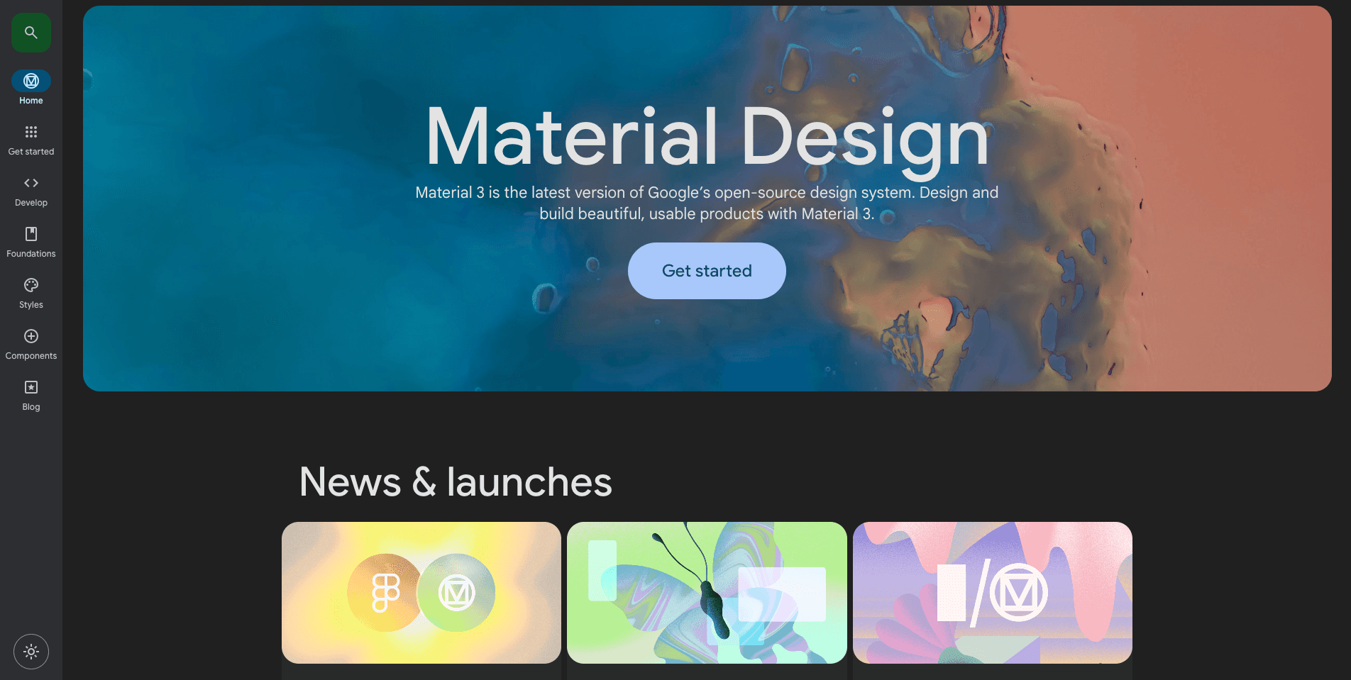
We had to find open-source design systems that share common design principles with FunDS. We picked these 3 as a result:
Material Design 3 by Google (has good documentation)
Atlassian Design System by Atlassian (responsive design and has a good foundation)
Polaris Design System by Shopify (good design craft & micro interaction)

Material Design 3
Material Design 3

Atlassian Design System
Atlassian Design System

Polaris Design System
Polaris Design System
Through this process, I gained valuable insights into the construction of design systems at these three companies, understanding their foundational elements and how they optimized their design systems performance. These findings allow my team and me to adopt best practices and work towards achieving our targets.
Through this process, I gained valuable insights into the construction of design systems at these three companies, understanding their foundational elements and how they optimized their design systems performance. These findings allow my team and me to adopt best practices and work towards achieving our targets.
1.2 User Research
1.2 User Research
After getting an idea of the design system that will be created, we conducted user research to get the latest insight into the current condition of our product, as well as looking for other findings that could strengthen Amartha's branding and design principles.
After getting an idea of the design system that will be created, we conducted user research to get the latest insight into the current condition of our product, as well as looking for other findings that could strengthen Amartha's branding and design principles.
Key findings:
Key findings:
The UI of the app was a bit outdated and needed a revamp.
Accessibility of colors and some components needs to be improved.
Strengthening the brand by creating a new design concept that’s more suitable to users.
The UI of the app was a bit outdated and needed a revamp.
Accessibility of colors and some components needs to be improved.
Strengthening the brand by creating a new design concept that’s more suitable to users.
1.3 Set a Timeline
1.3 Set a Timeline
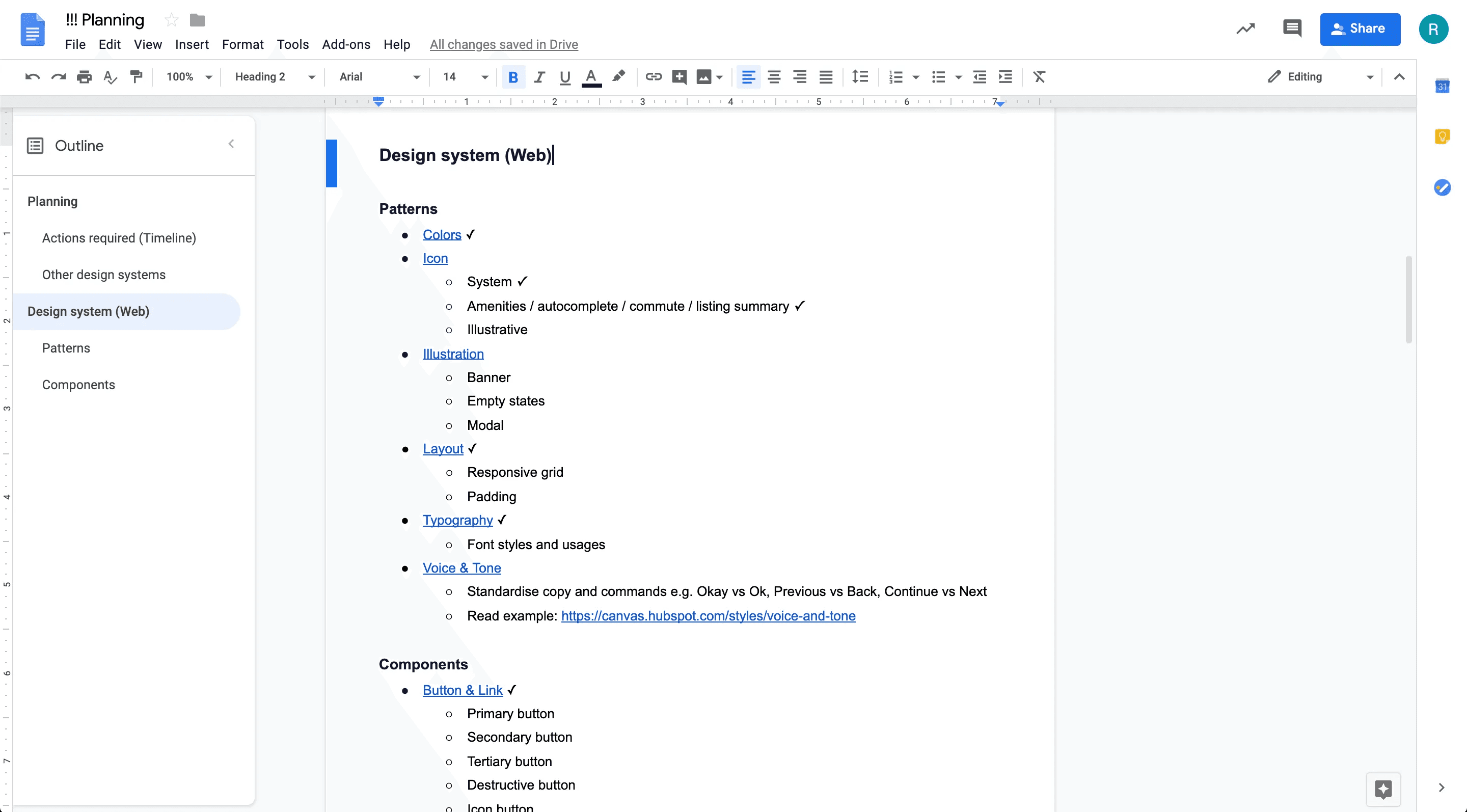
Next, we created a weekly timeline outlining what needed to be done and by whom. This kept stakeholders and everyone involved in the design system updated on progress and facilitated resource allocation. We prioritized discussing the most commonly used components based on use cases in Asana. We addressed foundational patterns like Typography, Colors, and Layout first, as subsequent components would build upon them.
Next, we created a weekly timeline outlining what needed to be done and by whom. This kept stakeholders and everyone involved in the design system updated on progress and facilitated resource allocation. We prioritized discussing the most commonly used components based on use cases in Asana. We addressed foundational patterns like Typography, Colors, and Layout first, as subsequent components would build upon them.
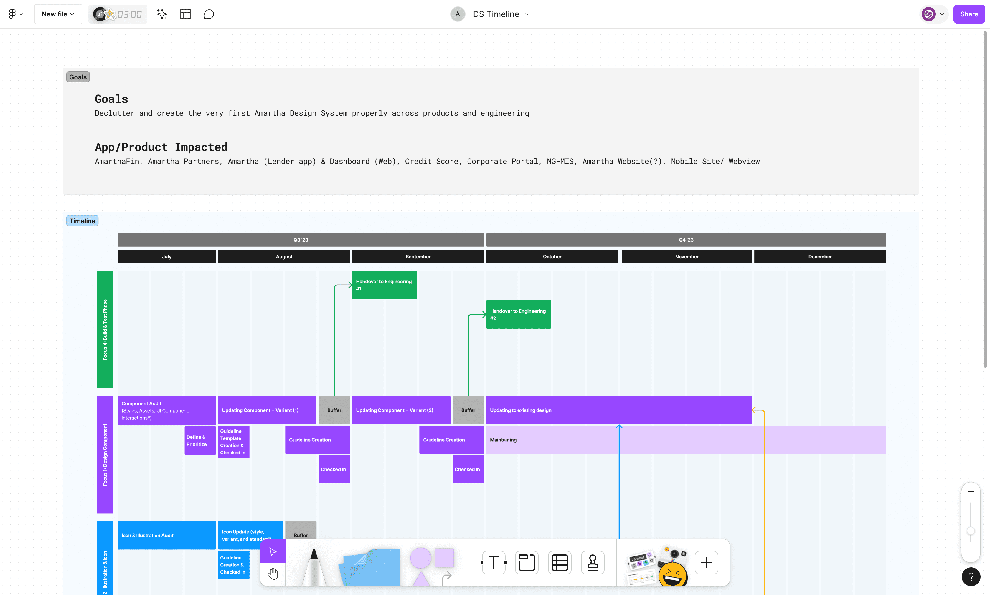
FunDS Project Timeline
FunDS Project Timeline
2. Review
2. Review
To better understand the current state of our existing design ecosystem, we started with a UI Inventory of our main interface components. We used Brad Frost’s interface inventory guideline as inspiration to conduct a full-day audit that we ran as a team of 5 designers. We split into three groups and assigned each a set of components to go over on our site and build an inventory around.
To better understand the current state of our existing design ecosystem, we started with a UI Inventory of our main interface components. We used Brad Frost’s interface inventory guideline as inspiration to conduct a full-day audit that we ran as a team of 5 designers. We split into three groups and assigned each a set of components to go over on our site and build an inventory around.
2.1 Create UI Inventory
2.1 Create UI Inventory
The plan was to screenshot unique instances of our main design assets such as typography, buttons, icons, input forms, dropdowns, etc., and add them to our Figma Audit file we had prepared ahead of time. Then each group shared their findings with the team.
The plan was to screenshot unique instances of our main design assets such as typography, buttons, icons, input forms, dropdowns, etc., and add them to our Figma Audit file we had prepared ahead of time. Then each group shared their findings with the team.
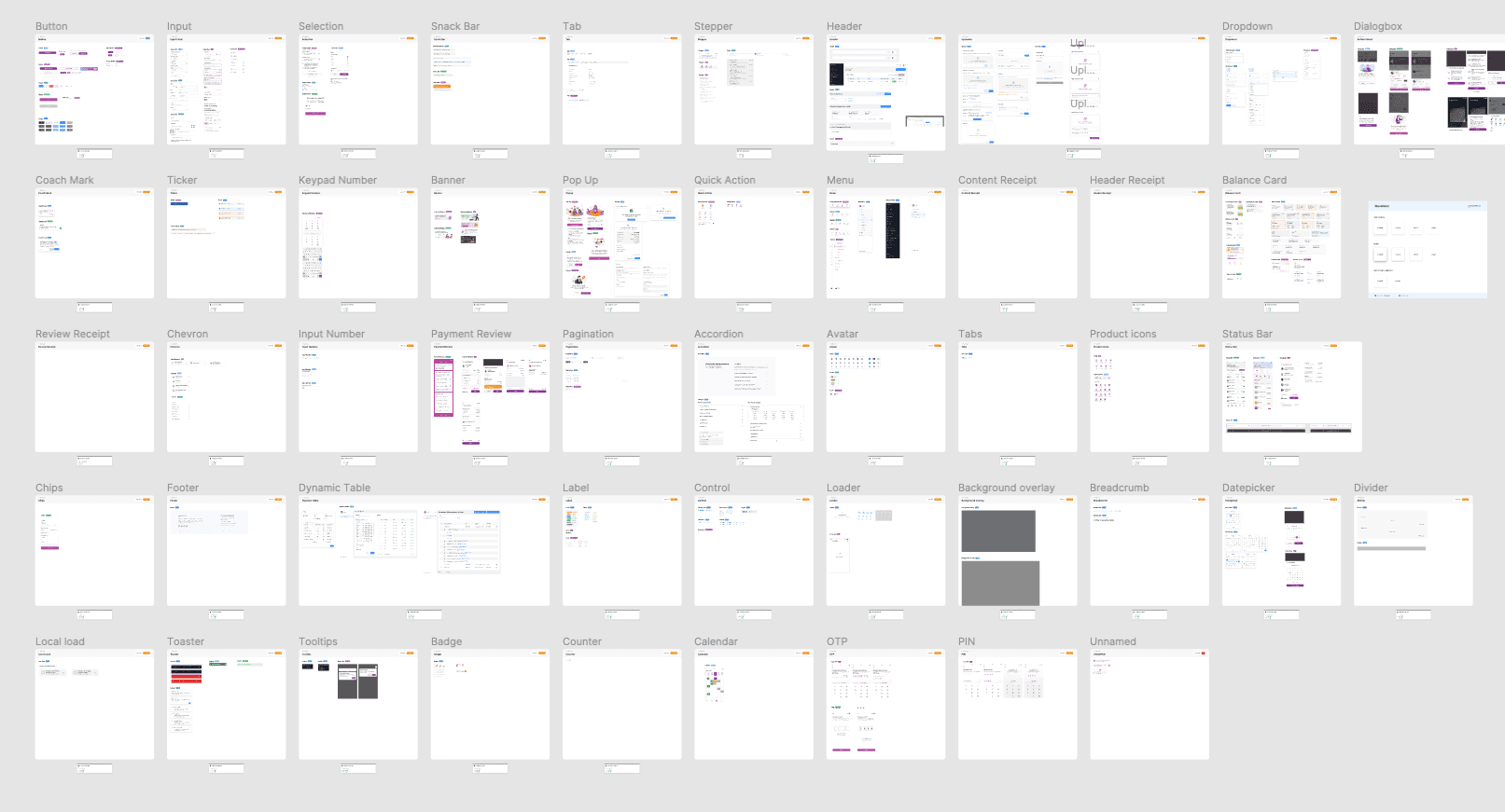
Amartha UI Design Inventory
Amartha UI Design Inventory
As a result of this exercise, we identified a lot of inconsistencies in our design assets and many variants of some existing products. These results prove the need for a more systematic approach to documenting, communicating, and maintaining our design systems.
As a result of this exercise, we identified a lot of inconsistencies in our design assets and many variants of some existing products. These results prove the need for a more systematic approach to documenting, communicating, and maintaining our design systems.
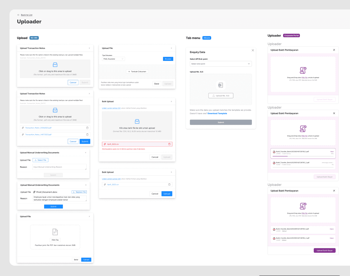
Inventory of Uploader components
Inventory of Uploader components
The inventory process helped us clearly see all discrepancies and inconsistencies across our site and product. It served as a foundation for our design system work. With the audit results in mind, we created a priority list for our design system minimal viable product (MVP), and started assigning designers that would lead the exploration and documentation of each component.
The inventory process helped us clearly see all discrepancies and inconsistencies across our site and product. It served as a foundation for our design system work. With the audit results in mind, we created a priority list for our design system minimal viable product (MVP), and started assigning designers that would lead the exploration and documentation of each component.
2.2 List out components
2.2 List out components
After researching other system designs, I circled back to create a list of patterns and components we needed based on the research and labels we had in the audit file and compared them to other system designs. This gives us an idea of what needs to be reviewed, used, or just a name change, so we can track and plan the time accordingly.
After researching other system designs, I circled back to create a list of patterns and components we needed based on the research and labels we had in the audit file and compared them to other system designs. This gives us an idea of what needs to be reviewed, used, or just a name change, so we can track and plan the time accordingly.
After researching other system designs, I circled back to create a list of patterns and components we needed based on the research and labels we had in the audit file and compared them to other system designs. This gives us an idea of what needs to be reviewed, used, or just a name change, so we can track and plan the time accordingly.
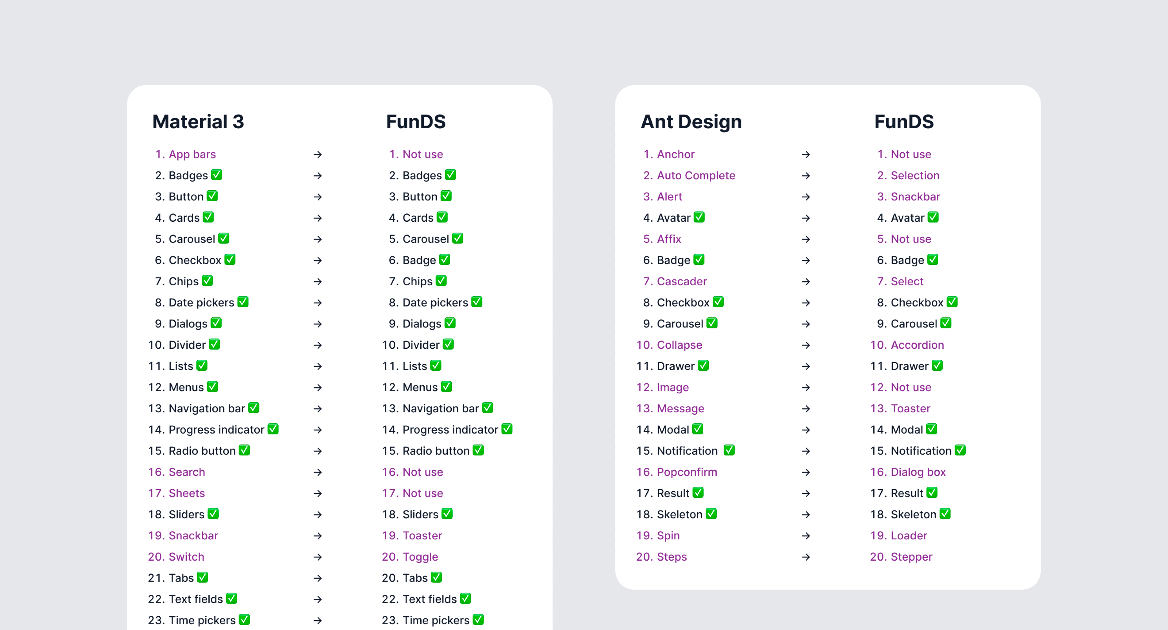
Component list
Component list
I organized components into the following sections based on their functions — Buttons, Data Input, Data Display, Feedback, and Navigation. The list gets revised continuously and ticked off whenever we finish discussing a component.
I organized components into the following sections based on their functions — Buttons, Data Input, Data Display, Feedback, and Navigation. The list gets revised continuously and ticked off whenever we finish discussing a component.
Component planning
Component planning
3. Design
3. Design
We decided to focus first on the foundational elements (atoms) of our design system, such as color palettes, typography, system grid, spacing, icons, etc., and then move on to more complex blocks and pieces (molecules, organisms, templates, pages). Some of the activities at this stage involved:
Researching other design systems and interfaces for components common practices and inspiration.
Analyzing the instances and use cases captured during the audit and ideating on the solutions that serve our goals best.
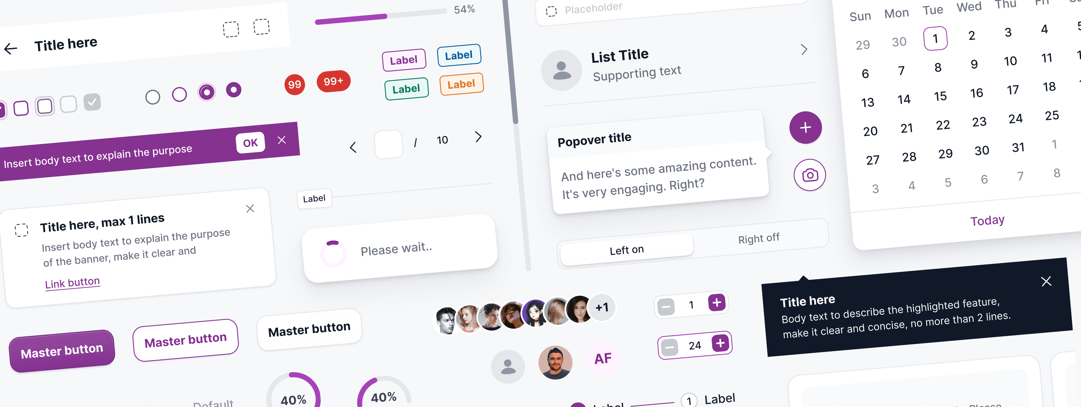
Unifying: we merged different variations of components to leave only the essentials. For example, we limited our color schemes to a maximum of 9 shades for each hue, and all the excessive variations were matched and merged with the decided upon schemes based on proximity. Below is our final color palette:
We decided to focus first on the foundational elements (atoms) of our design system, such as color palettes, typography, system grid, spacing, icons, etc., and then move on to more complex blocks and pieces (molecules, organisms, templates, pages). Some of the activities at this stage involved:
Researching other design systems and interfaces for components common practices and inspiration.
Analyzing the instances and use cases captured during the audit and ideating on the solutions that serve our goals best.
Unifying: we merged different variations of components to leave only the essentials. For example, we limited our color schemes to a maximum of 9 shades for each hue, and all the excessive variations were matched and merged with the decided upon schemes based on proximity. Below is our final color palette:
3.1 Building Foundations
3.1 Building Foundations
Because the app was constantly evolving, our secondary criteria for the design system was to create a flexible architecture that could adapt to future changes easily and seamlessly. Together with the lead developer, we defined a generic structure upon which we would build the system - essentially breaking down all elements into their most atomic form. Most importantly, the most common elements like typography styles, colors, inputs, and buttons would be detached from any specific context.
Because the app was constantly evolving, our secondary criteria for the design system was to create a flexible architecture that could adapt to future changes easily and seamlessly. Together with the lead developer, we defined a generic structure upon which we would build the system - essentially breaking down all elements into their most atomic form. Most importantly, the most common elements like typography styles, colors, inputs, and buttons would be detached from any specific context.
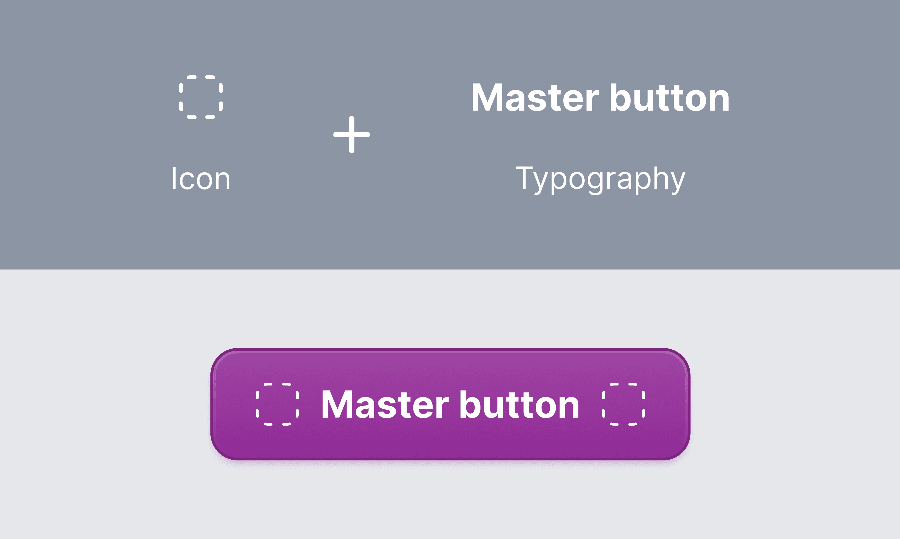
For example, we defined our typography styles with generic names instead of specific ones (i.e. “title” instead of “card-title”).
For example, we defined our typography styles with generic names instead of specific ones (i.e. “title” instead of “card-title”).
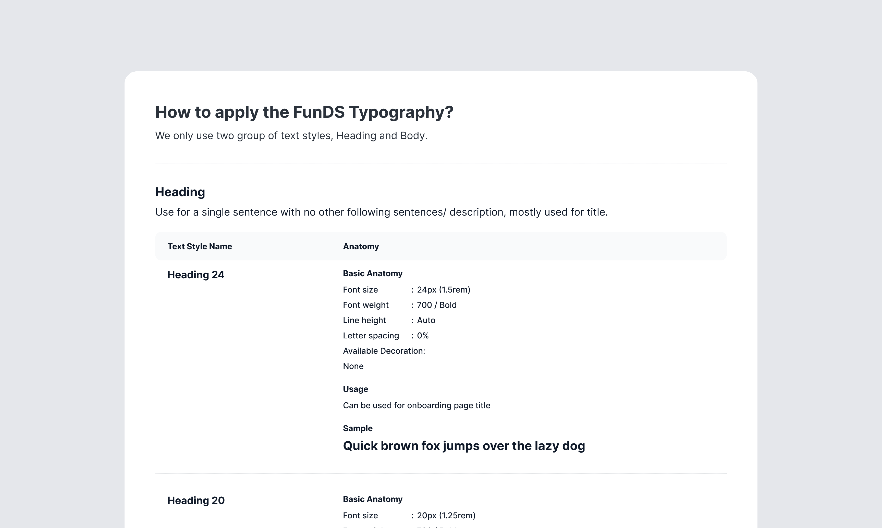
FunDS Typography
FunDS Typography
This decision proved to be key to the success of our design system. Utilizing this centralized method of control makes communication between devs and designers much simpler and most importantly enables us to make cross-app changes very easily.
This decision proved to be key to the success of our design system. Utilizing this centralized method of control makes communication between devs and designers much simpler and most importantly enables us to make cross-app changes very easily.
Similarly, our color palette was broken down into system colors spread across several tints. This proved to be flexible enough for use but also scalable if needed for future expandability.If we ever want to change the main color of the app, we could do it in one place and instantly change it across all components. Besides the system colors, we automatically generate these tints for any color chosen by our user - allowing for true customization while still staying within the design system’s logic.
Similarly, our color palette was broken down into system colors spread across several tints. This proved to be flexible enough for use but also scalable if needed for future expandability.If we ever want to change the main color of the app, we could do it in one place and instantly change it across all components. Besides the system colors, we automatically generate these tints for any color chosen by our user - allowing for true customization while still staying within the design system’s logic.
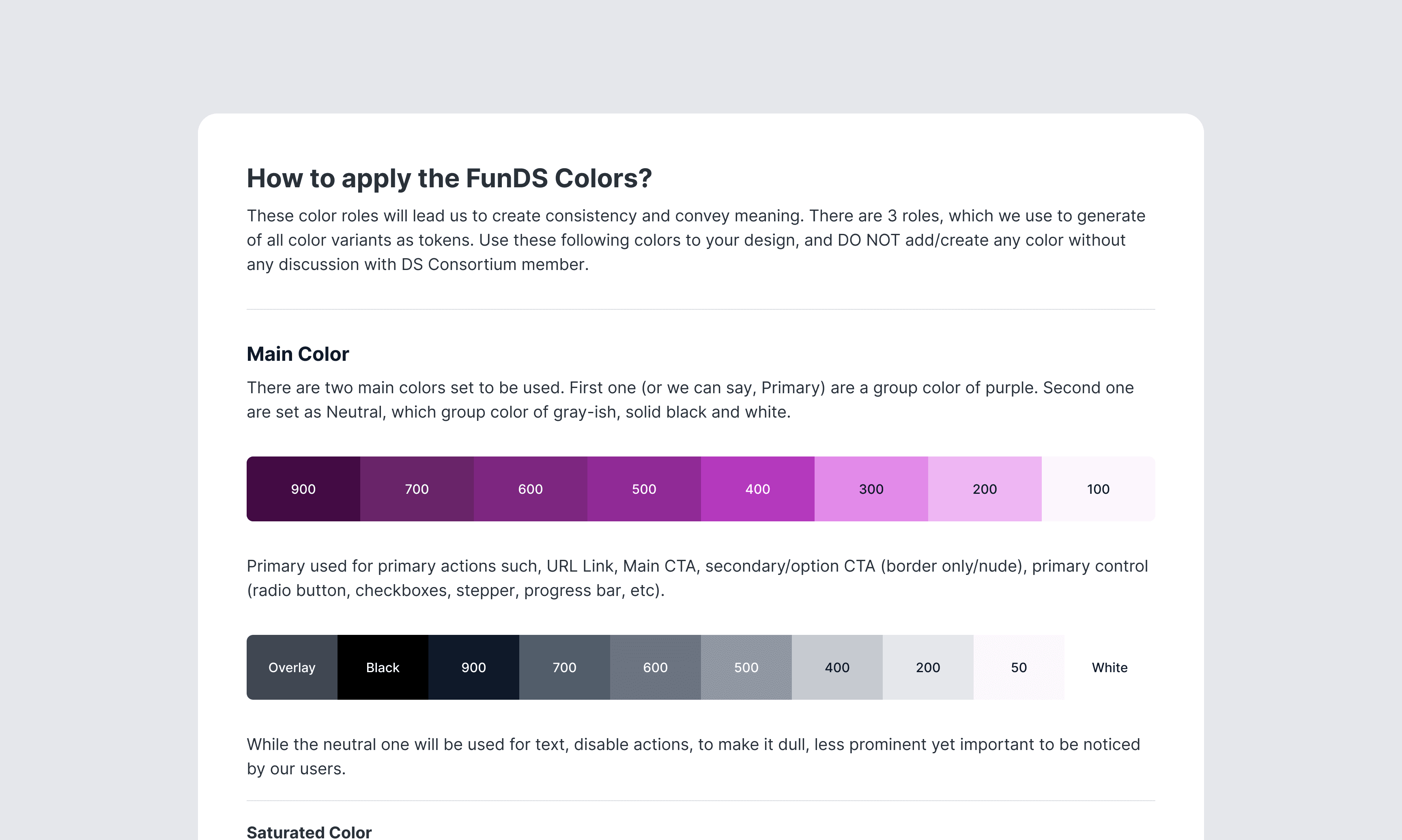
FunDS Colors
FunDS Colors
3.2 Atomic Design
3.2 Atomic Design
Based on Brad Frost’s Atomic Design, good design systems are style guides, which document and organize design materials while providing guidelines, usage, and guardrails. It includes brand identity, writing, voice and tone, code, design language, and user interface patterns.
Based on Brad Frost’s Atomic Design, good design systems are style guides, which document and organize design materials while providing guidelines, usage, and guardrails. It includes brand identity, writing, voice and tone, code, design language, and user interface patterns.
With a good design system, you can reuse all the design components in your product development process. It will reduce your product's time-to-market. You don’t have to focus on building the details of the design components. You can be more focused on user requirements, product testing, market validation, and other business-related things. When there’s an issue with the design components, you can quickly fix the source and all the pages that using the components will get the fixing patch.
With a good design system, you can reuse all the design components in your product development process. It will reduce your product's time-to-market. You don’t have to focus on building the details of the design components. You can be more focused on user requirements, product testing, market validation, and other business-related things. When there’s an issue with the design components, you can quickly fix the source and all the pages that using the components will get the fixing patch.
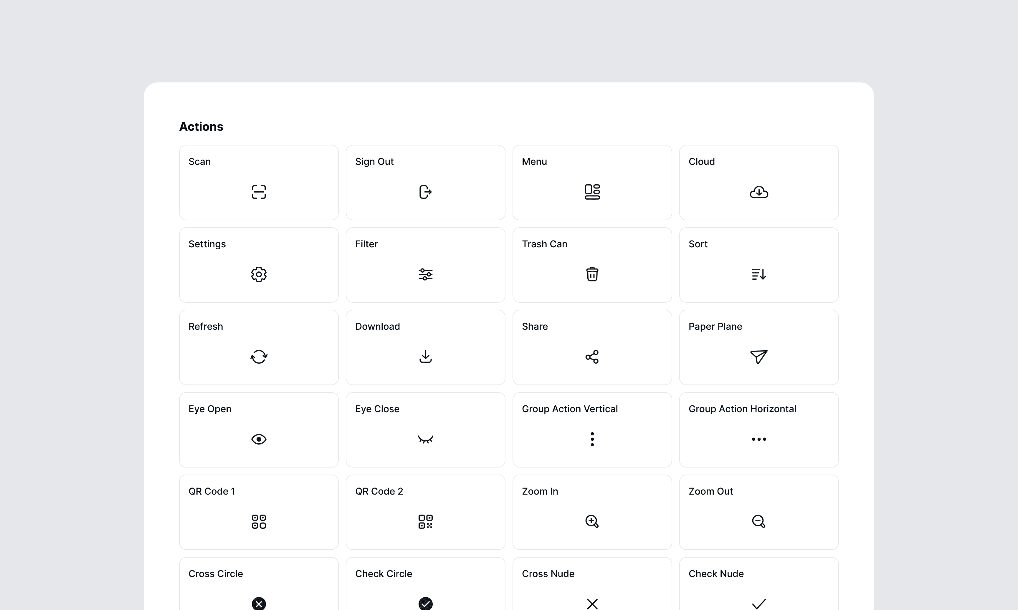
FunDS Iconography
FunDS Iconography
Atomic Implementation
Atomic Implementation
3.3 Applying properties and variables
3.3 Applying properties and variables
Component properties and variables in Figma allow designers to create reusable and customizable components. By defining properties and variables for components, designers can easily make changes to multiple instances of a component simultaneously, ensuring consistency across the design. This is particularly useful for maintaining design systems, as it allows for quick and efficient updates to components without the need to manually edit each instance.
Component properties and variables in Figma allow designers to create reusable and customizable components. By defining properties and variables for components, designers can easily make changes to multiple instances of a component simultaneously, ensuring consistency across the design. This is particularly useful for maintaining design systems, as it allows for quick and efficient updates to components without the need to manually edit each instance.
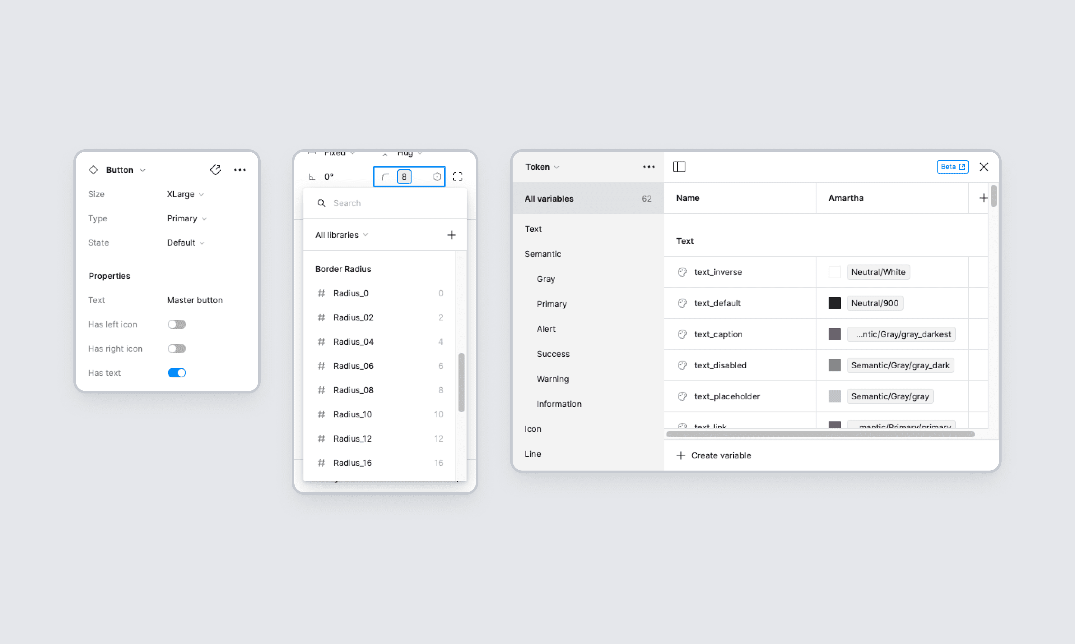
Component properties & Variables
Component properties & Variables
Additionally, properties and variables make it easier to collaborate with team members, as they provide a clear and standardized way to define and update component styles and behaviors.
Additionally, properties and variables make it easier to collaborate with team members, as they provide a clear and standardized way to define and update component styles and behaviors.
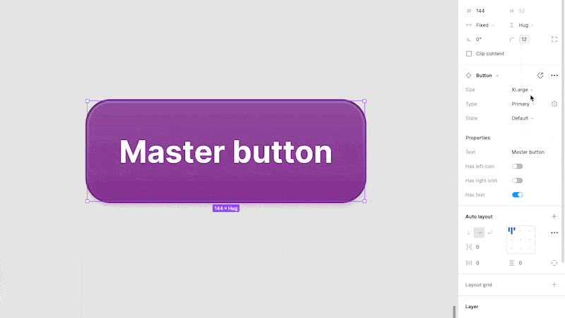
Applying properties to the FundS button
Applying properties to the FundS button
Documentation
Documentation
High-quality component documentation is crucial to an effective library, allowing everyone to quickly and efficiently make consistent decisions. We wanted to create detailed documentation that would support every single aspect of our design system, and also be organized, consistent, and easy to use. We referred to several design systems, such as IBM’s Carbon, Material Design 3, Atlassian, Polaris Shopify, and other design systems for some good practices, guidelines, and tools that we could apply in our design system.
High-quality component documentation is crucial to an effective library, allowing everyone to quickly and efficiently make consistent decisions. We wanted to create detailed documentation that would support every single aspect of our design system, and also be organized, consistent, and easy to use. We referred to several design systems, such as IBM’s Carbon, Material Design 3, Atlassian, Polaris Shopify, and other design systems for some good practices, guidelines, and tools that we could apply in our design system.
Google's Material Design 3
Google's Material Design 3
4.1 Design-led Documentation
4.1 Design-led Documentation
In this process, documentation is created by considering needs and design perspectives. This means that documentation doesn't just focus on technical or functional details, but also pays attention to aesthetics, user experience, and design principles that are consistent with the company's visual identity and design values. With this approach, documentation becomes not only a functional reference, but also a powerful communication tool to strengthen the Amartha brand and product design quality.
In this process, documentation is created by considering needs and design perspectives. This means that documentation doesn't just focus on technical or functional details, but also pays attention to aesthetics, user experience, and design principles that are consistent with the company's visual identity and design values. With this approach, documentation becomes not only a functional reference, but also a powerful communication tool to strengthen the Amartha brand and product design quality.
At a high level, most of our component documentation usually includes:
Introduction with component description
Component usage
Component behaviour
Accessibility guidelines
Best practices
Component spesifications
Examples of components in different contexts to demonstrate how design patterns would be applied in real products and specific use cases
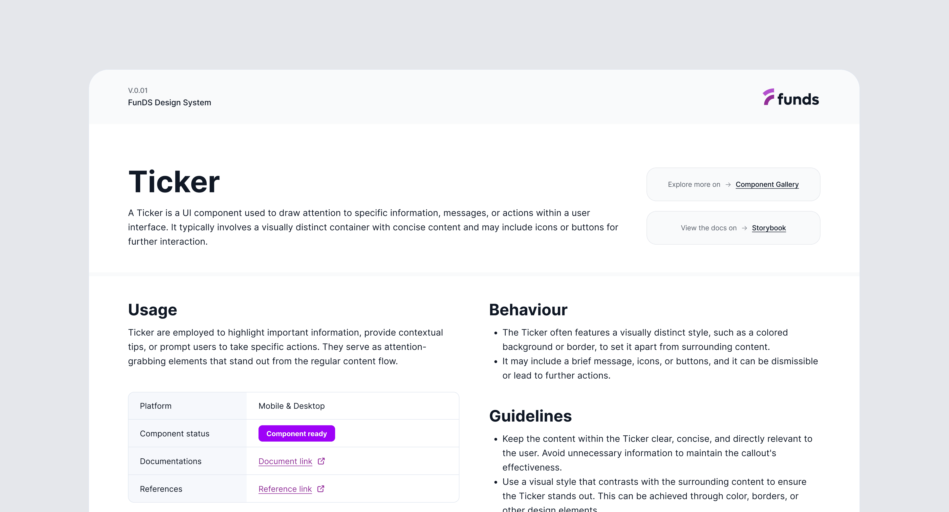
FunDS component documentation - Ticker
FunDS component documentation - Ticker
4.2 Storybook Components Repository
4.2 Storybook Components Repository
Storybook has become The DevOps tool for developing and maintaining design systems. The platform's excellent documentation, intuitive UI, built-in testing, and collaborative features make it the perfect tool for building and releasing components. Understanding how Storybook works can help designers collaborate with front-end devs better and leverage the platform’s features to improve prototyping and testing.
Storybook has become The DevOps tool for developing and maintaining design systems. The platform's excellent documentation, intuitive UI, built-in testing, and collaborative features make it the perfect tool for building and releasing components. Understanding how Storybook works can help designers collaborate with front-end devs better and leverage the platform’s features to improve prototyping and testing.
However, this is our long-term target, once everything is settled we'll start using Storybook between Q3-Q4 2024.
However, this is our long-term target, once everything is settled we'll start using Storybook between Q3-Q4 2024.
4.3 Tracking Progress
4.3 Tracking Progress
To track and communicate the progress of the different steps, we created a Jira board that can be viewed and updated both by design and development. We create tickets for specific components that link out to all the relevant documentation and move them to corresponding status columns (In Design, Needs Feedback, In Development, etc.) throughout the process.
To track and communicate the progress of the different steps, we created a Jira board that can be viewed and updated both by design and development. We create tickets for specific components that link out to all the relevant documentation and move them to corresponding status columns (In Design, Needs Feedback, In Development, etc.) throughout the process.
Apart from that, we also track component creation and development in a simple table on Google Spreadsheets. By modifying the table in this article, we redesigned the tracker according to our team's needs.
Apart from that, we also track component creation and development in a simple table on Google Spreadsheets. By modifying the table in this article, we redesigned the tracker according to our team's needs.
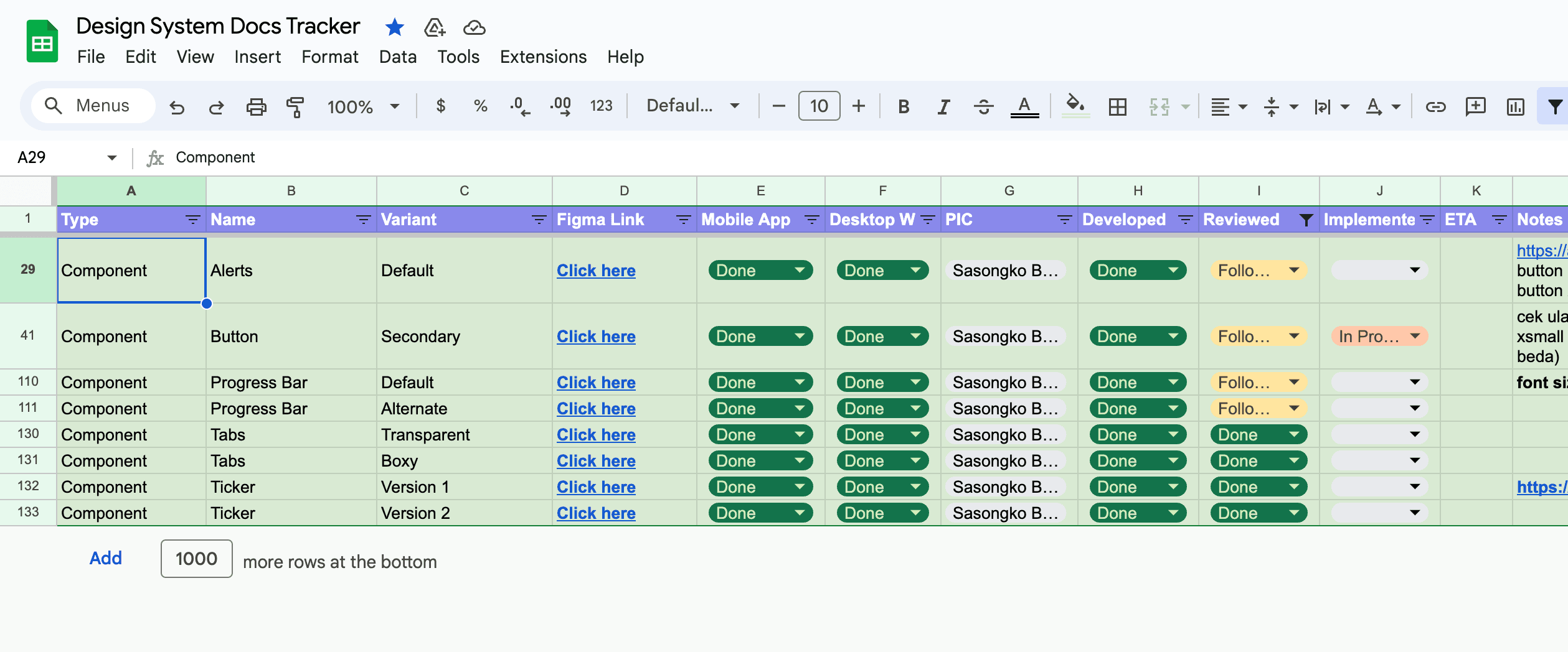
Funds Design System Tracker
Funds Design System Tracker
Implement design system
Implement design system
The first step that needs to be taken in the implementation process is outreach to the team of engineers and other stakeholders regarding the latest state of this system design. Then engineers can start developing each component in order based on the component's priority. We prioritize components that are on pages that are rarely visited by users, so as not to interfere with their activities when using our apps.
The first step that needs to be taken in the implementation process is outreach to the team of engineers and other stakeholders regarding the latest state of this system design. Then engineers can start developing each component in order based on the component's priority. We prioritize components that are on pages that are rarely visited by users, so as not to interfere with their activities when using our apps.

Collaboration Tool
Collaboration Tool
The collaboration tool we used to implement the design system is Figma Dev Mode. This feature is designed to help developers accelerate the UI implementation by generating code snippets. When you activate the dev mode, you can simply hover and click objects to get details like measurements, specs, and styles, all within a safe space that won’t impact the design file.
Thanks Figma for this feature ✨
After the development process by engineers, in parallel, we also socialize it with other designers so that they can use the new components in the design system library. We also hold weekly sessions to replace new components so that the app merger process becomes faster.
After the development process by engineers, in parallel, we also socialize it with other designers so that they can use the new components in the design system library. We also hold weekly sessions to replace new components so that the app merger process becomes faster.
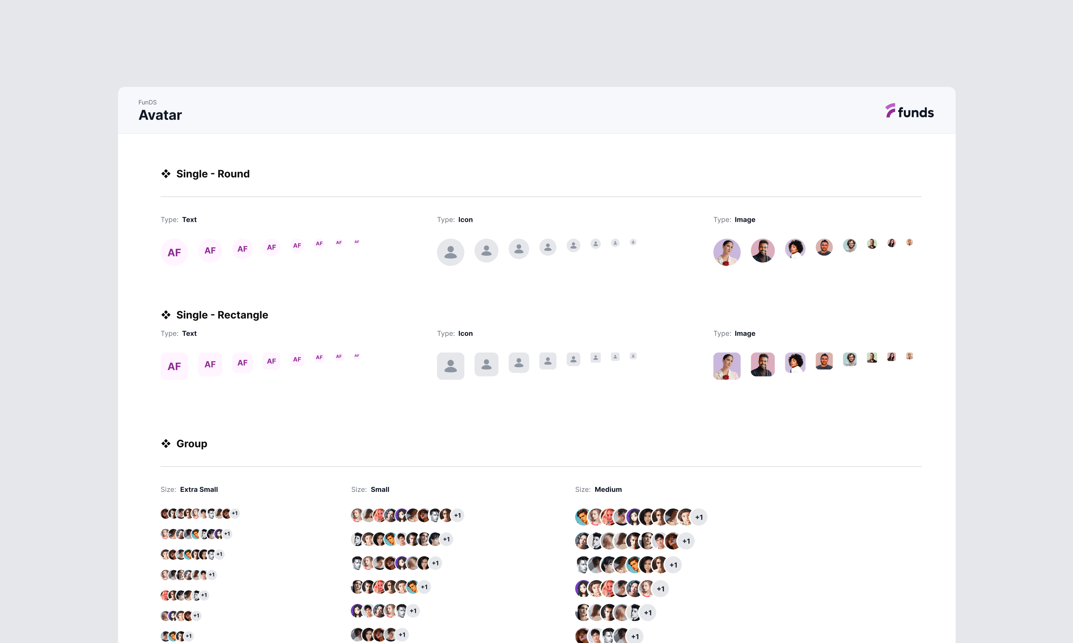
FunDS - Avatar components
FunDS - Avatar components
Examples of component usage
Examples of component usage
Below are several examples of the use of new design components that have been created
Below are several examples of the use of new design components that have been created
Avatar
Avatar component to provide a visual representation of users across the application.
Tabs Menu
Tabs typically consist of a set of clickable elements (often text or icons) that represent each section of content.
List
A list is typically composed of multiple items, each represented by a text label, icon, or other visual element.
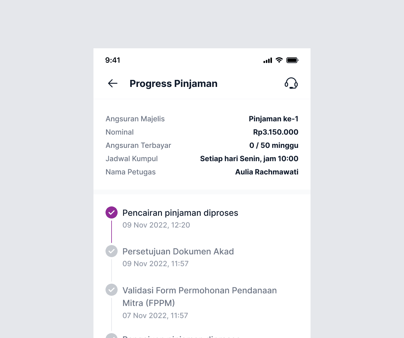
Progress Indicator
A progress indicator is often displayed as a horizontal bar or a series of circles, each representing a step or milestone.
What's the impact?
What's the impact?
For designers
For designers
It has become a lot easier to create, share, and synchronize quite an extensive set of components at a much faster rate. Also, going forward it will eventually help us in easy knowledge transfer to the new team members.
It has become a lot easier to create, share, and synchronize quite an extensive set of components at a much faster rate. Also, going forward it will eventually help us in easy knowledge transfer to the new team members.
For developers
For developers
The component library they created based on the UIkit helped them maintain the sanity of code and consistency in the final product.
The component library they created based on the UIkit helped them maintain the sanity of code and consistency in the final product.
For company
For company
We achieved the goal of making all the businesses look consistent across platforms.
We achieved the goal of making all the businesses look consistent across platforms.
Tracking Adoption and Satisfaction with the module
Tracking Adoption and Satisfaction with the module
After the design system release for design teams, we socialize them to use the component library for their ongoing and next project. Also, for read all the component guidelines. While doing that, we also measure these metrics in the first 3 months after the introduction.
And the results are:
After the design system release for design teams, we socialize them to use the component library for their ongoing and next project. Also, for read all the component guidelines. While doing that, we also measure these metrics in the first 3 months after the introduction.
And the results are:
±80%
Adoption Rate
Adoption Rate
Around 80% of the existing apps have already been recreated using the new component. While the new project always uses this new component.
Around 80% of the existing apps have already been recreated using the new component. While the new project always uses this new component.
4.82
Satisfaction Score
Satisfaction Score
The new design systems achieves a 4.82 out of 5 for ease and satisfaction scores from all designers and developers who use it.
The new design systems achieves a 4.82 out of 5 for ease and satisfaction scores from all designers and developers who use it.
The Future
The Future
The design system is an ongoing project. We iterate, change, and learn a lot in the process. So far, we have a set of basic components ready, which has been game-changing for our team in terms of efficiency, as well as consistency, and standardization.
The design system is an ongoing project. We iterate, change, and learn a lot in the process. So far, we have a set of basic components ready, which has been game-changing for our team in terms of efficiency, as well as consistency, and standardization.
Some of our team’s next steps include:
Continuing to grow our component library and supplement it with more complex components.
Adding sections on brand, illustrations, and animation.
Cultivating processes and best practices for maintaining the documentation to ensure that our library stays up to date-and perfectly in sync both on the design and code side.
Raising awareness across the teams and promoting adoption and contribution to the documentation.
Building processes for testing the components on compliance with guidelines and accessibility standards.
💪🏻
💪🏻
Special thanks to Mas Angga (design lead), Mas Edwin (PM), Denny & Mas Nino (Eng lead), and the rest of the design team for your valuable contributions and support! :)
Special thanks to Mas Angga (design lead), Mas Edwin (PM), Denny & Mas Nino (Eng lead), and the rest of the design team for your valuable contributions and support! :)
[
02
/
02
]
FOOTER
[
02
/
02
]
FOOTER
Thanks for
stopping by!
Feel free to reach out for collaboration
purposes or just a friendly hello :)
sasongkobr@gmail.com
Thanks for
stopping by!
Feel free to reach out for collaboration
purposes or just a friendly hello :)
sasongkobr@gmail.com
Thanks for stopping by!
Feel free to reach out for collaboration
purposes or just a friendly hello :)
sasongkobr@gmail.com
Thanks for stopping by!
Feel free to reach out for collaboration
purposes or just a friendly hello :)
sasongkobr@gmail.com
Thanks for
stopping by!
Feel free to reach out for collaboration purposes or just a friendly hello :)
Copy email
Get in touch